
My Sky Sports message portal
The My Sky Sports message portal was to be a one-stop-shop for all Sky Business needs. No more waiting for snail mail - everything is just a few clicks away.
Read the case study below ⬇️
My Role
UI UX Designer
Year
2022
Background
My Sky Sports, an online platform under Sky Business TV, caters to businesses in the hospitality sector, including pubs, clubs, hotels, and unconventional locations like oil rigs and prisons. It enables users to promote upcoming sports matches they will be broadcasting at their establishments via social media and printable posters. The platform's primary objective is to assist customers in their marketing efforts.
To provide enhanced value to customers, we conducted research and identified their strong desire for a comprehensive message portal. This portal would enable them to manage invoices, communicate with Sky for support, and give the My Sky Sports landing page a fresh and updated look.
Find out more about My Sky Sports…
Problem Statement
My Sky Sports users lack a user-friendly and efficient method to access information like invoices and contracts, relying on outdated postal communication.
This leads to inefficiencies, inconvenience, and a lack of real-time data access. A solution is needed to streamline information management, improve user experience, and transition to a modern digital platform.
How might we
How might we create a user-friendly message portal that enables users access to contracts, invoices, and the ability to communicate with Sky?
How might we elevate the user experience and accessibility of the My Sky Sports platform by integrating a visually captivating design that effectively presents a wide range of sports and entertainment shows for our customers?
Mission
Create a user-friendly platform that enables seamless communication with Sky through a message system, while also providing the ability to download invoices and view the latest bill.
Moreover, design an intuitive and easily accessible placement for this platform within the primary navigation, ensuring users can effortlessly locate and utilize its features.
User Research
Our target audience consists of business owners in the hospitality industry, specifically pubs, bars, and clubs. While they primarily show Sky Sports, there is a growing demand to include other TV products like shows and series from Sky.
To understand their needs, we gathered feedback on their interactions with My Sky Sports. Customers expressed the desire for a comprehensive portal that handles all aspects of their entertainment business. However, they faced challenges with business administration tasks such as managing accounts, invoices, renewals, and permissions. Another frustration was the lack of responsiveness throughout the site.
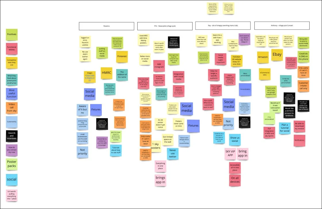
Forming Personas
Based on the user workshop I thought it would be a good idea to make personas of our customers. To do this I worked with both the qualitivaer data and quunatative data. I found this a a useful exercise as I could translate their frustrations and desires from My Sky Sports into a persona and this helped translating these ssues to our steakholders.


Steak-holder worksop
To ensure comprehensive coverage of our platform requirements, I conducted an internal brainstorming session with key members from the Sky Business Team, including Business Analysts, Solution Architects, and developers. This collaborative technique enabled us to gather diverse perspectives and identify essential elements for implementation.
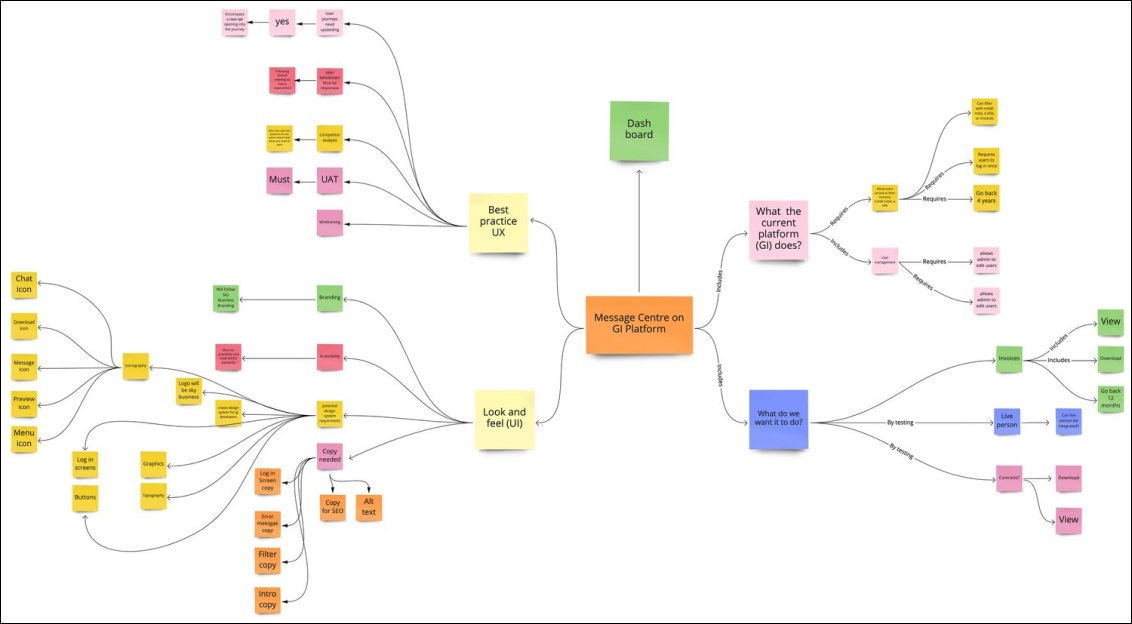
Presenting the findings
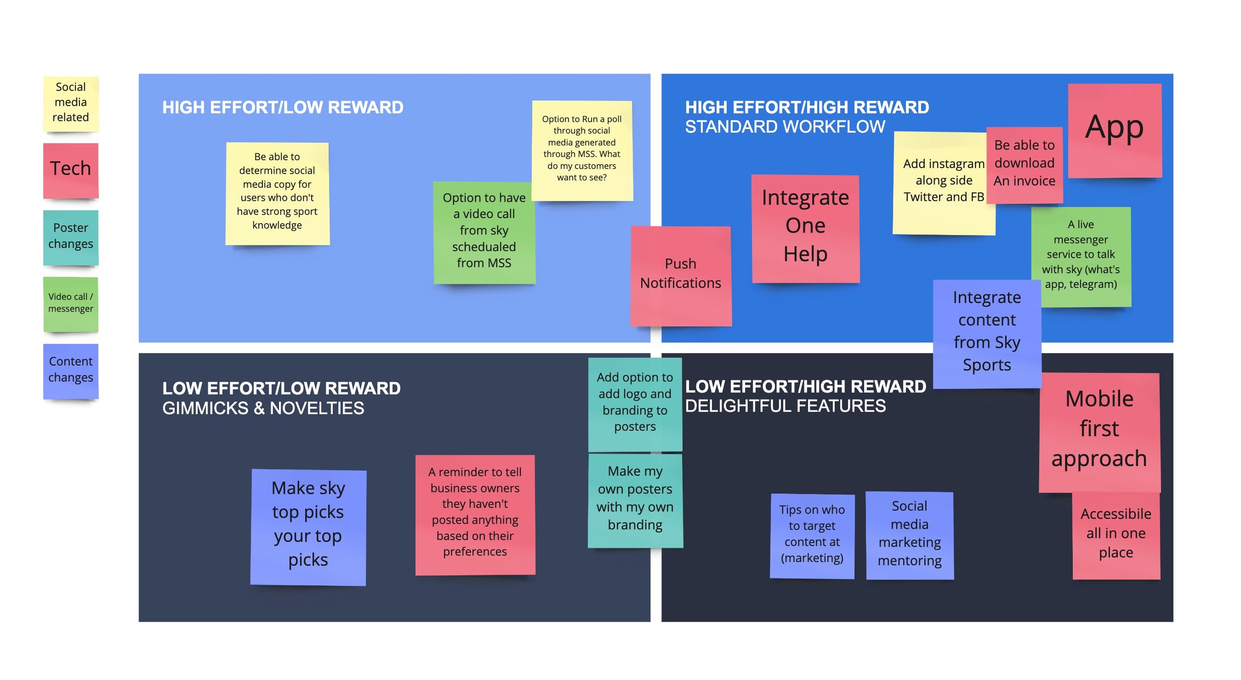
Following the workshops I was able to present back to the steak-holders what the users wanted and what the steak holders could offer with restrictions of budget, resources and allocation of time. Below is part of that presentation.

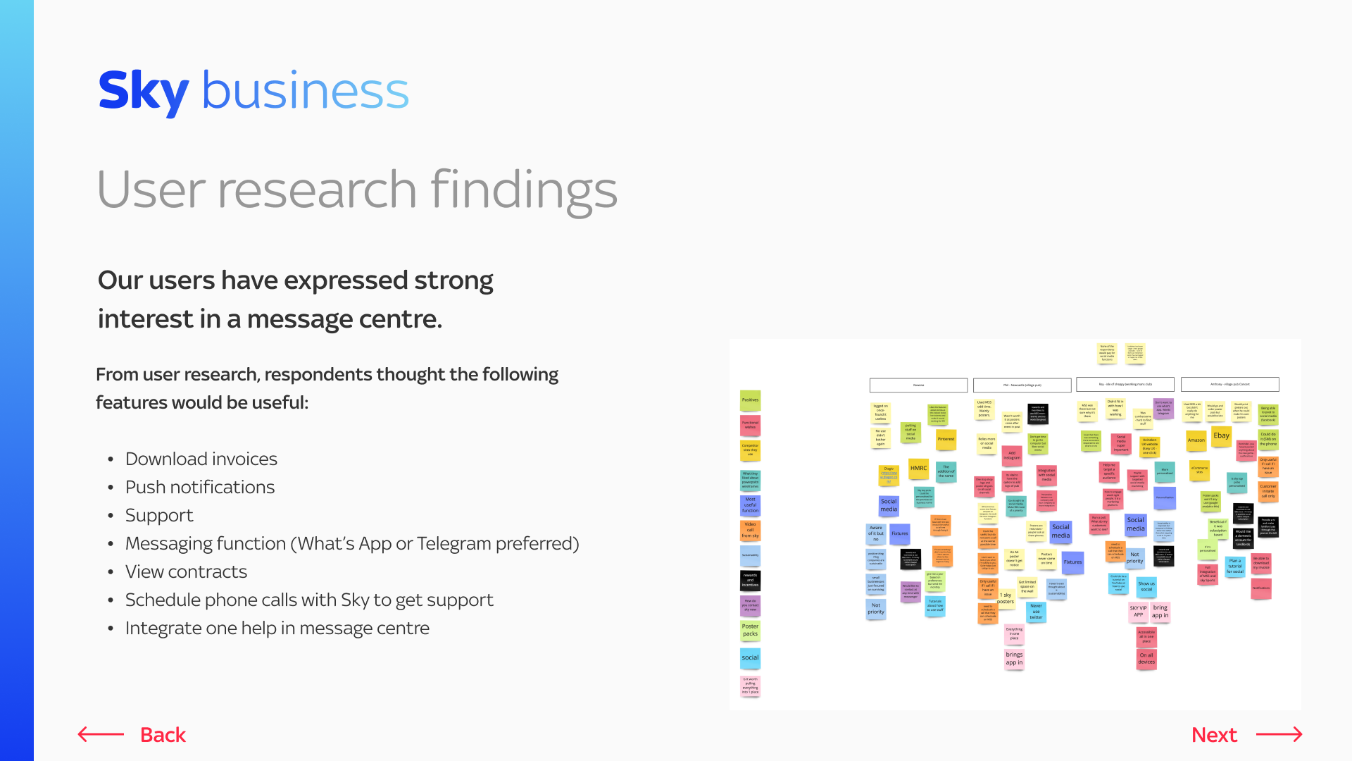


What users wanted

A My Sky Sports App

Download/view invoices and contracts

Push notifications

Messaging functionality (potentially on What’s App or Telegram)

Schedule support calls with Sky

One Help integration into a message portal
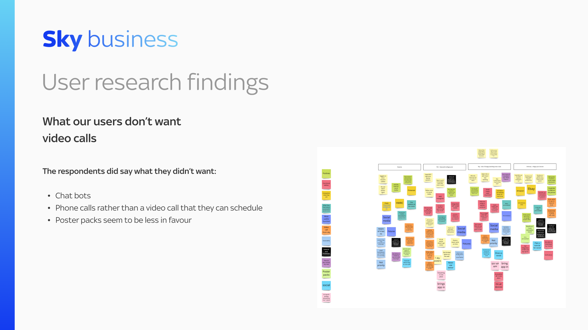
What Sky could offer
Integration of One Help
View/Download invoices
or contracts
A messaging portal but not on What’s App or Telegram
Push Notifications as part of the redesigned My Sky Sports
landing page.
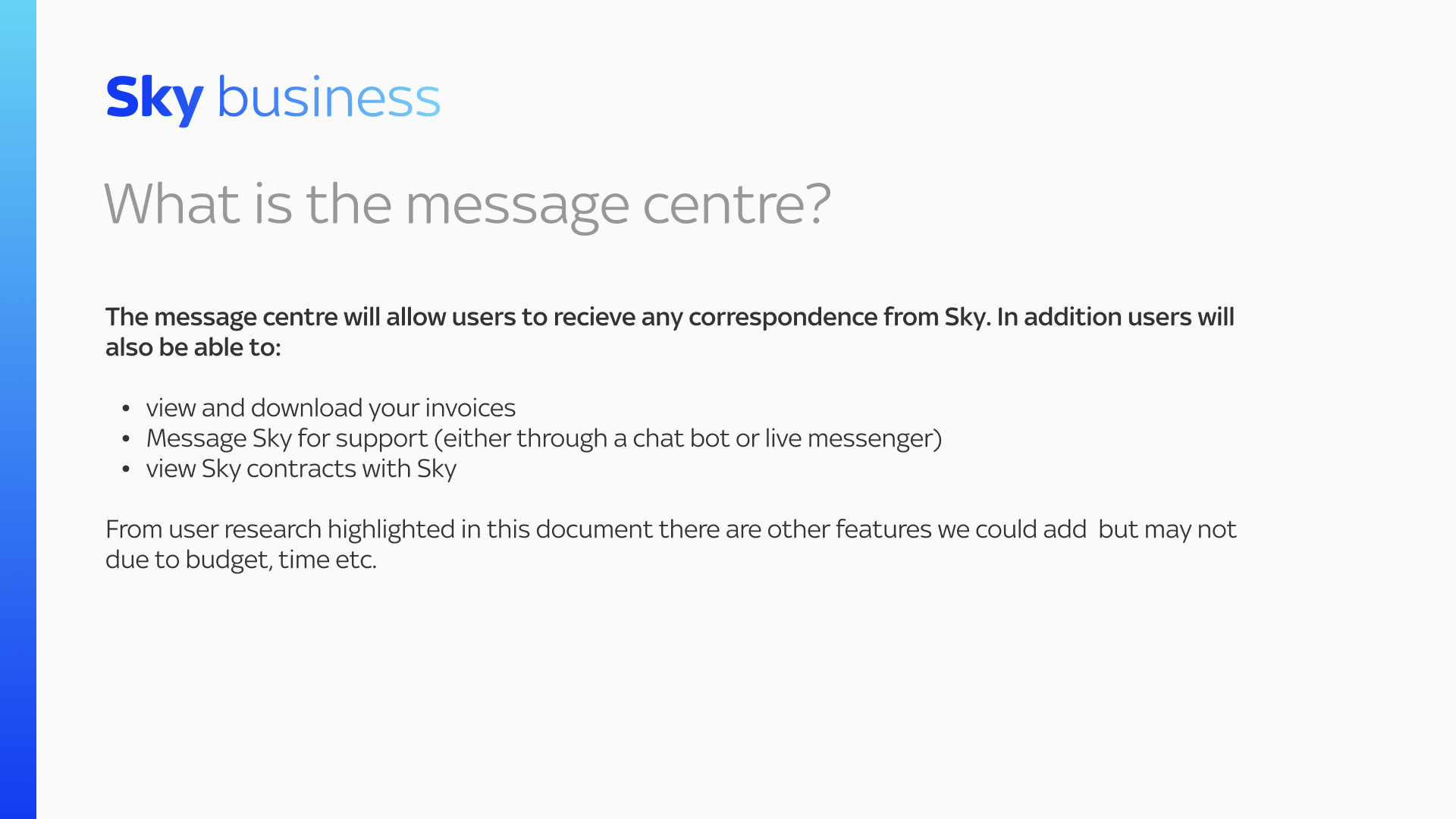
Design Brief
-
Create a message portal within My Sky Sports that offers users enhanced functionality and improves the overall user experience. The focus is on providing features that are both valuable to users and feasible within the allocated budget.
-
Due to cost and development limitations, certain features like app integration, Instagram integration, and WhatsApp capabilities are not feasible. The design solution will prioritise the following key features:
Download and View Invoices and Contracts:
Users should have a seamless and intuitive way to access and review their invoices and contracts within the portal.
Messaging Support:
The portal should allow users to easily communicate with Sky for support, addressing their questions or account/billing inquiries. Quick response times from Sky are crucial for a satisfactory user experience.
Enhanced Navigation:
Efforts should be made to ensure easy navigation to the Message Centre from the landing page. This may require revisiting the information architecture and optimising the navigation flow.
Redesigned My Sky Sports Landing Page:
The current landing page for My Sky Sports needs a contemporary redesign that showcases both sports and entertainment offerings. The design should be visually appealing, engaging, and in line with the Sky brand.
-
The project must work within the allocated budget, prioritising cost-effective solutions and utilising existing infrastructure where possible. The design should also align with Sky's branding guidelines.
-
The success of the project will be measured by improved user satisfaction, increased engagement with My Sky Sports, and positive feedback from stakeholders.
Key performance indicators include user feedback surveys, metrics on invoice and contract access, and response times from Sky Support.
Understanding our user groups

Creating
user journeys
First iteration
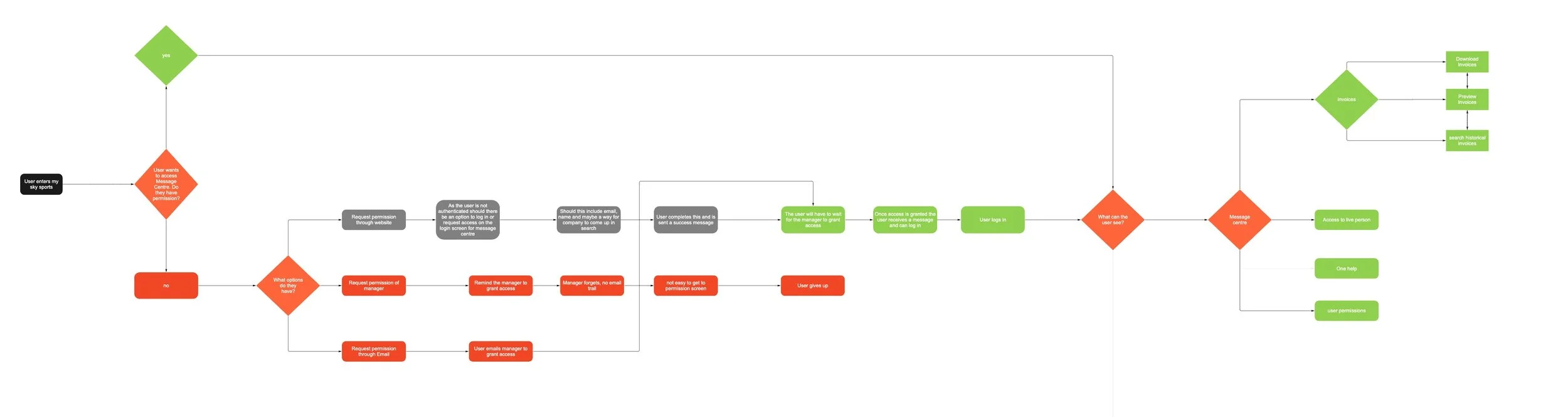
The top yellow section of the journey shows how a signatory can access the message centre and the green journey shows how a user would request access from their manager to get access to the Message Centre.


Finalised journey focused on permissions
It was clear user permissions were becoming a challenge so the journey below focused on that issue.
Feedback
After internal feedback there was a fear that non-signatory users would find it difficult to know how to request access to the message centre so I iterated the journey map after considering that the user can click help and there would be an option to request access to message centre. This would be a link to correct part of the account panel and be a one-click button to access the message centre. This would also help the signatories who would administer permissions.
Sketching and Wireframing
I sketched iteratively to develop the UX of the platform, taking into account the features and overall functionality. Additionally, I refined components such as navigation, toolbars, and user profiles. To further enhance the information architecture (IA) of each screen, I converted my analog sketches into digital low-fidelity (lo-fi) wireframes.

I Started by sketching and thought cards for the different elements was worth exploring based on initial user testing
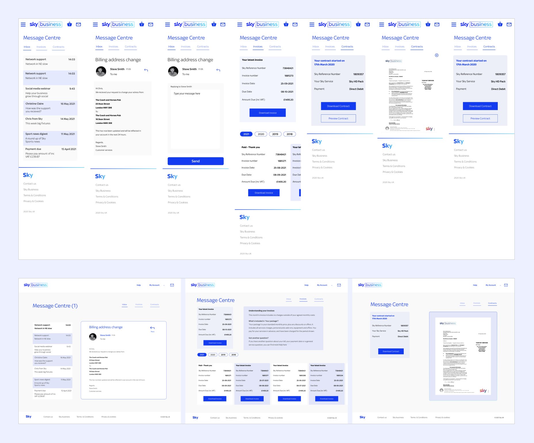
In mid-fi I looked at the idea of an inbox and cards where the user could see a summary of the invoice as well as download it
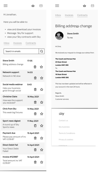
This is a close up of the inbox and messaging system
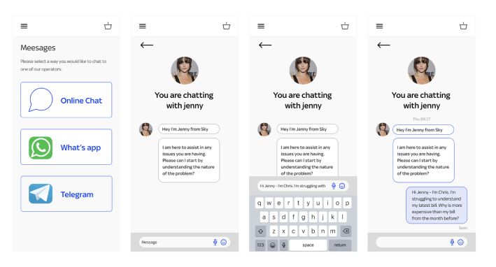
I wanted to consider other ways of messaging which the users requested including What's App and Telegram but didn't pursue it as it was not in scope
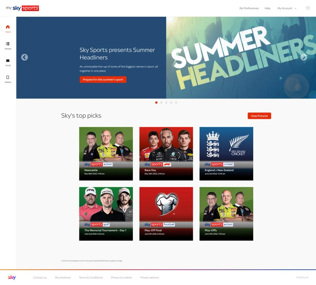
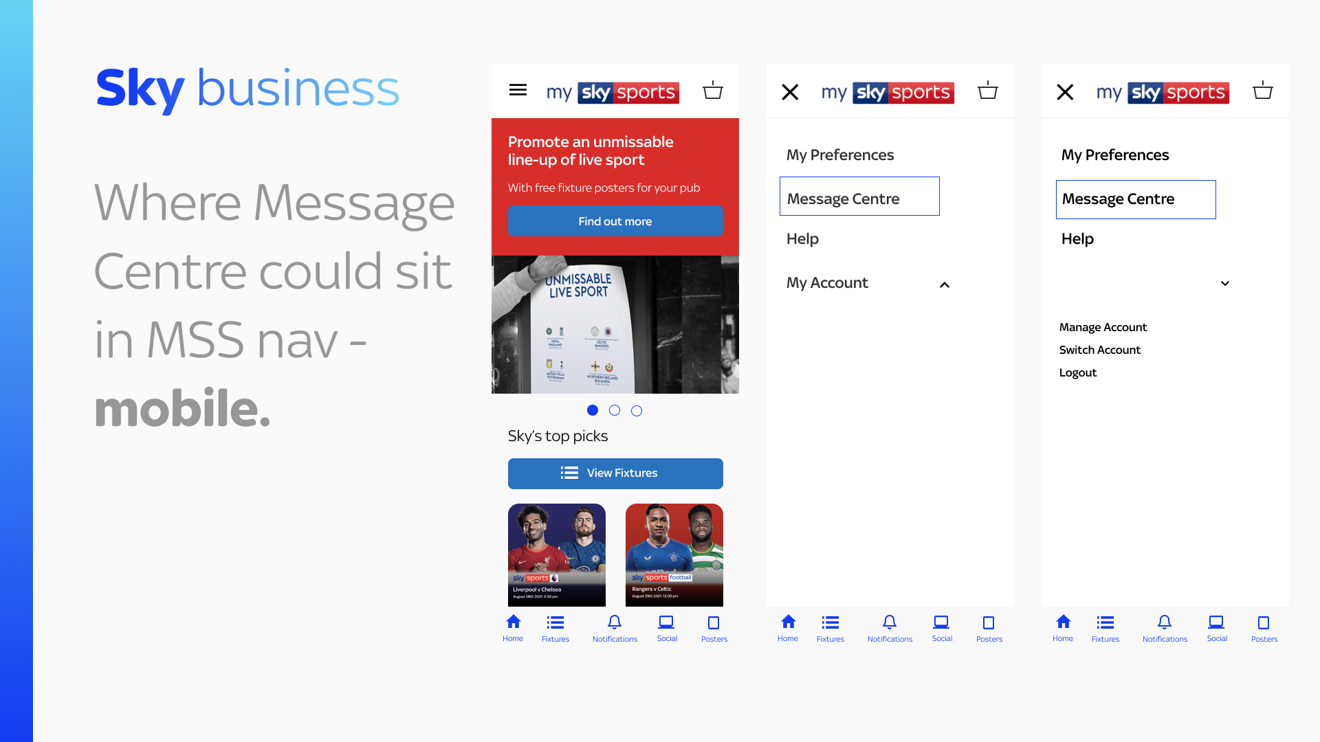
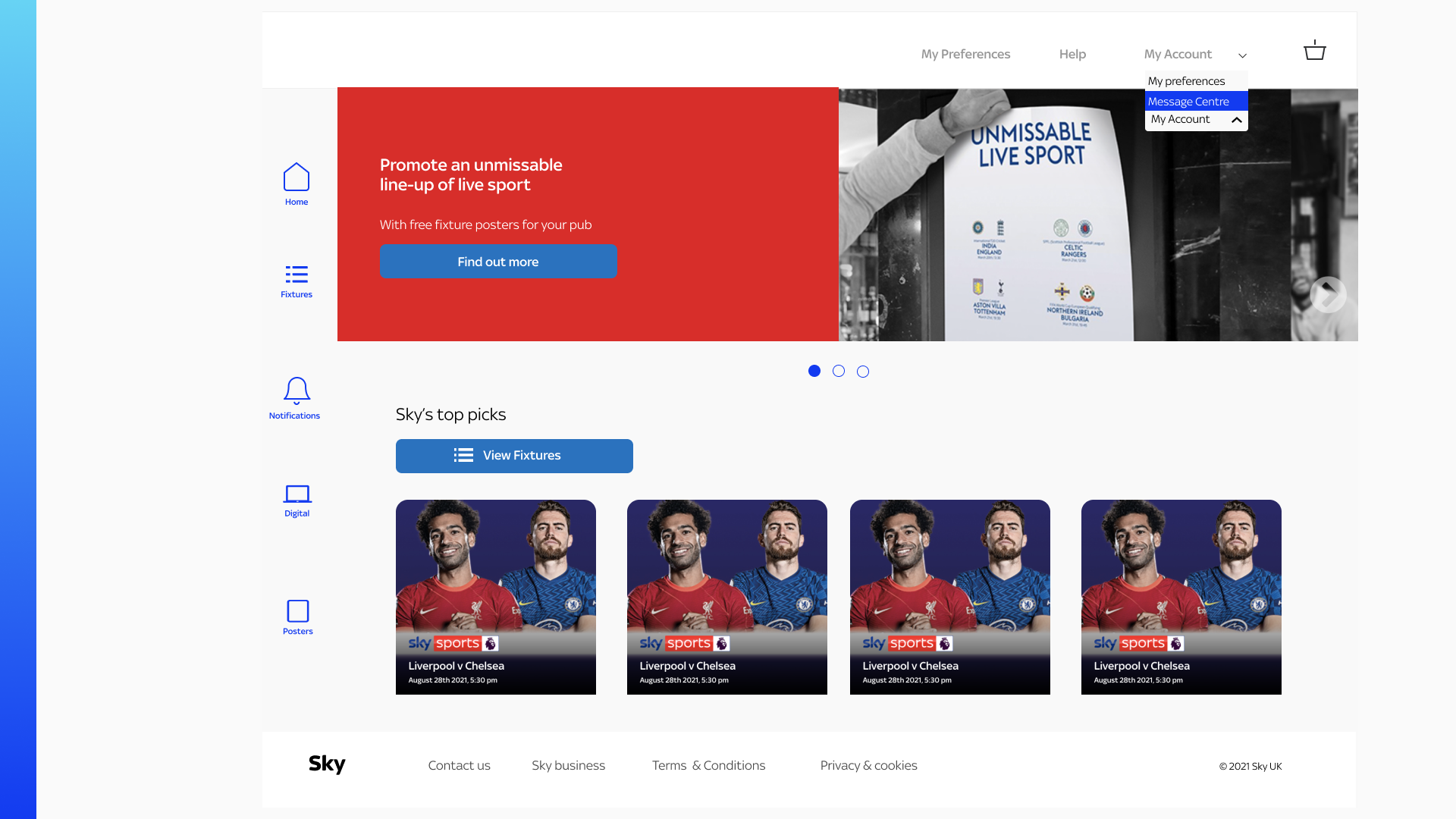
Current My Sky Sports Landing page without changes to navigation to include message centre.
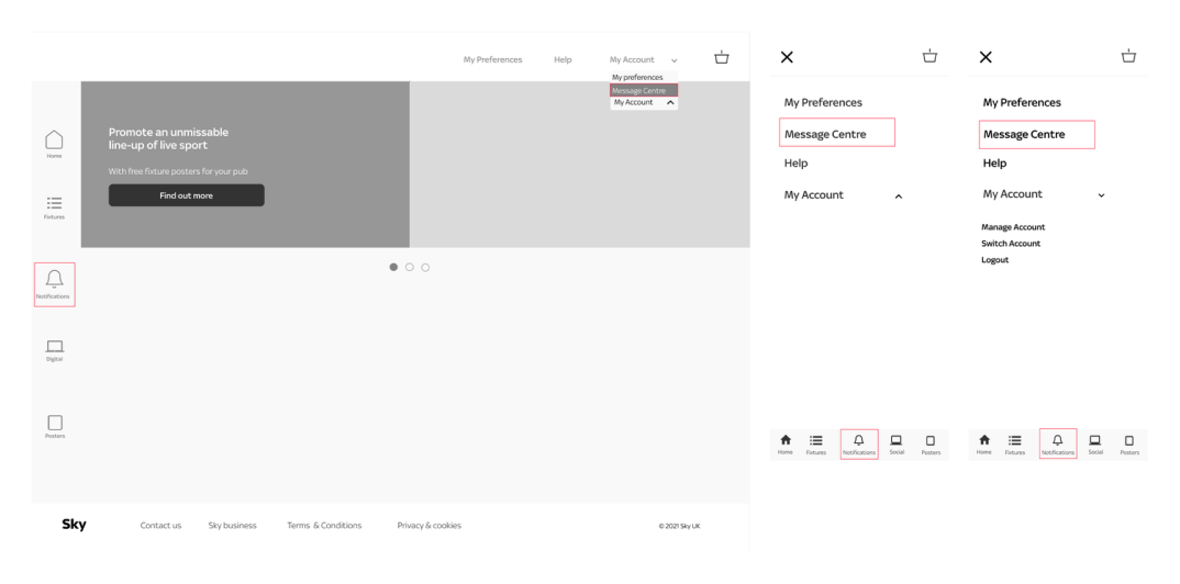
Initial plan: Message Centre added to My Account dropdown. Downsides: Buried feature, no notifications on message receipt.
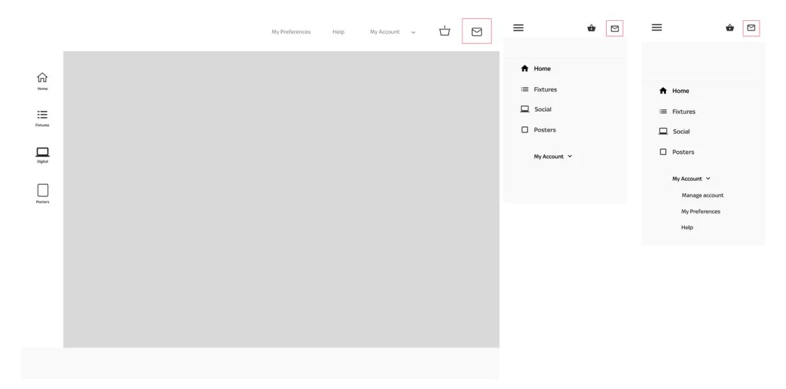
Revised approach: Second iteration - added icon for quick access to Message Centre and notifications.
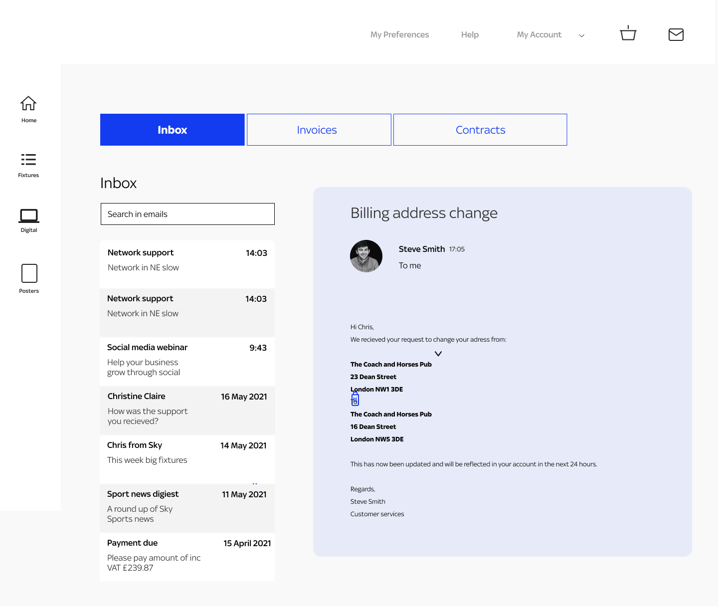
This was the first iteration of the inbox

This iteration allowed users to search by year for their invoices and download them using cards
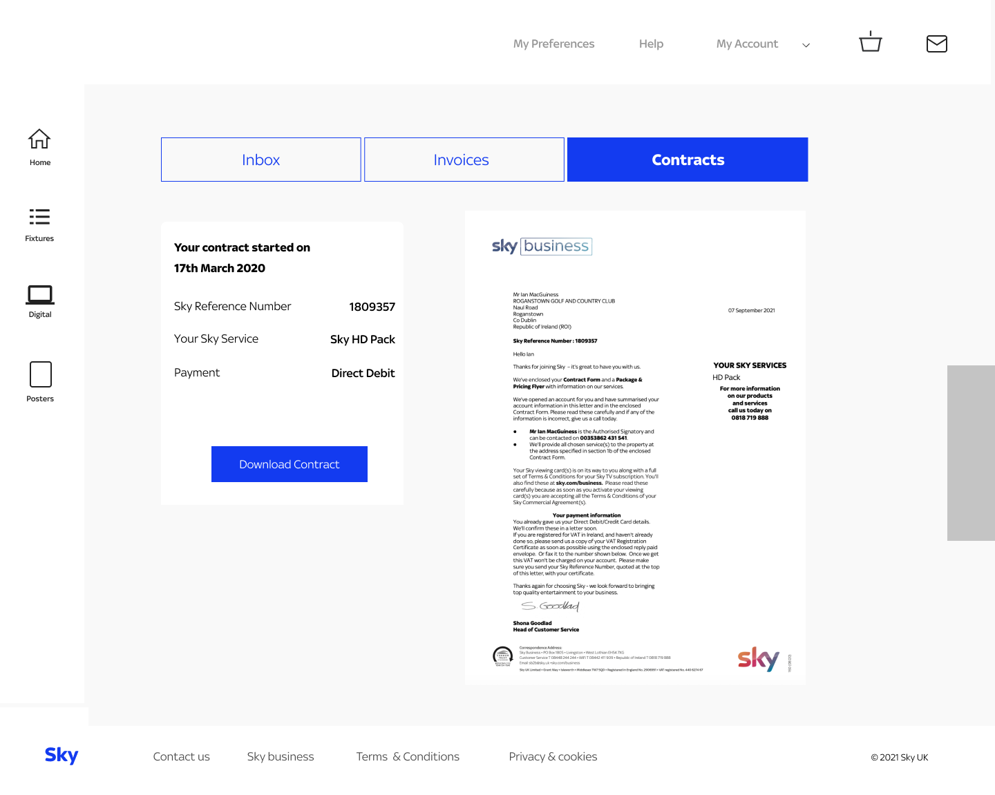
This is where users could view and download their contracts
Solution
I sketched iteratively to develop the UX of the platform, taking into account the features and overall functionality. Additionally, I refined components such as navigation, toolbars, and user profiles. To further enhance the information architecture (IA) of each screen, I converted my analog sketches into digital low-fidelity (lo-fi) wireframes.
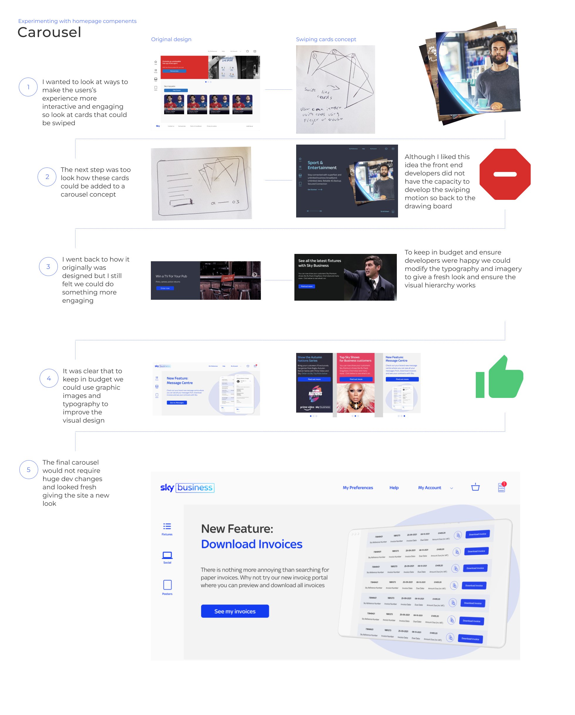
Redesigning the homepage
I sketched iteratively to develop the UX of the platform, taking into account the features and overall functionality. Additionally, I refined components such as navigation, toolbars, and user profiles. To further enhance the information architecture (IA) of each screen, I converted my analog sketches into digital low-fidelity (lo-fi) wireframes.

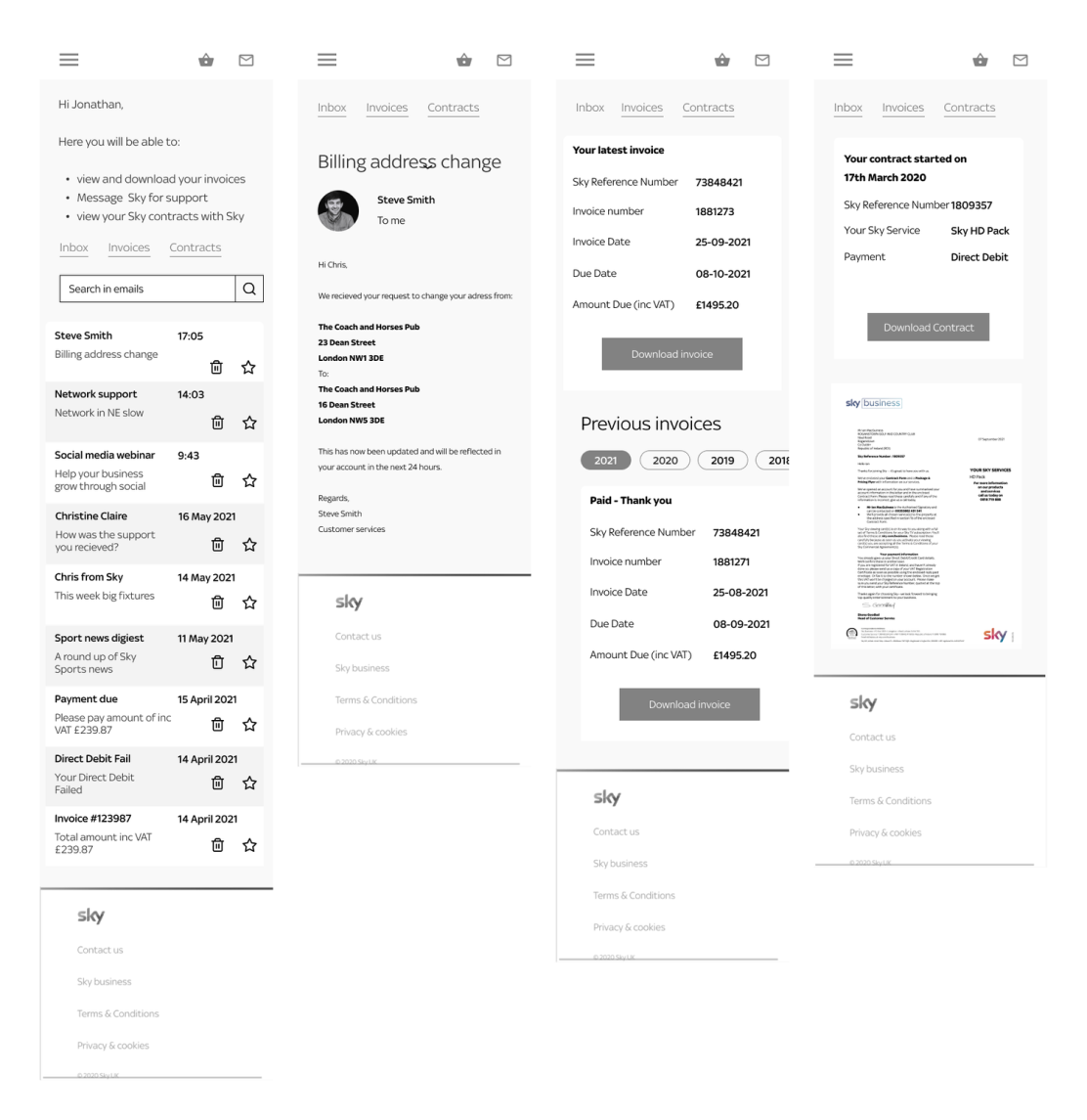
This displays the final design for the message centre which includes the inbox and the invoice section where users could preview and download invoices.
See prototype here

The revamped homepage of My Sky Sports breathed new life into the platform, providing an opportunity to showcase not only sports but also entertainment content, including popular shows like Ru Paul's Drag Race, which Sky excels at. Moreover, it served as a platform to introduce new features like the message centre, effectively raising awareness among users about these additions.
What was designed
A new messaging portal with an inbox
The ability for users to download and preview invocies and contracts

Transferable personas
Push notifications

A newly revamped homepage for My Sky Sports

Improved accessibility on the homepage

Enhanced navigation
Evaluation
I had a great experience working on the message centre project. Collaborating with stakeholders and bridging the gap between Sky and its users was truly enjoyable. The emotional investment from both sides made this project incredibly interesting. Although we faced limitations in terms of budget and resources, I believe we successfully addressed the users' needs by designing a platform that would ideally enhance their day-to-day business operations.
In retrospect, if there was one aspect I could alter in the execution of this project, it would be to ensure a clear design brief from the outset. Initially, the focus was solely on revamping other sections of the platform, and the redesign of the homepage was not included. However, it was later decided to incorporate the homepage into the brief, effectively merging two projects into one. Despite this adjustment, I thoroughly enjoyed working on the homepage redesign and understood the rationale behind Sky's decision to revamp it.