
Sky Business Rebrand.
Sky Business TV and Sky Connect have joined forces to create one Sky Business - a partner businesses can trust for all connectivity and entertainment needs.
Read the rebranding case study below.
My Role
UI Designer
Year
2023
Background
Sky Business is a new addition to the Sky brand. It considers itself a startup within Sky that offers businesses broadband, phone, and TV services. Sky Business’s main competitors are brands such as BT, EE, Virgin who all have strong established brand identities. Sky business is the new comer to this.
The rebranding project aimed to unify all their business services, encompassing three customer websites and two internal websites, print, merchandise and television adverts under a single, cohesive brand identity.
Find out what Sky Business do and see the new branding on the TV advert!
Video collaboration with creative designer Adetayo Soyoye
Problem Statement
Sky Business has a weak visual branding identity. Confusion is found in the fact Sky Business currently has multiple websites with different branding and disconnected user journeys which is resulting in low brand awareness and user confusion.
How might we
How might we develop a visual identity for Sky Business that will ensure visual consistency across multiple websites and increase brand awareness?
How might we also ensure that the new visual identity reflects Sky Business's commitment to digital accessibility?
Mission
Develop a comprehensive accessible visual identity for Sky Business that reflects its brand and values, while ensuring consistency across multiple websites and user journeys to increase brand awareness. Accessibility must be prioritised, demonstrating Sky Business's commitment to inclusivity.
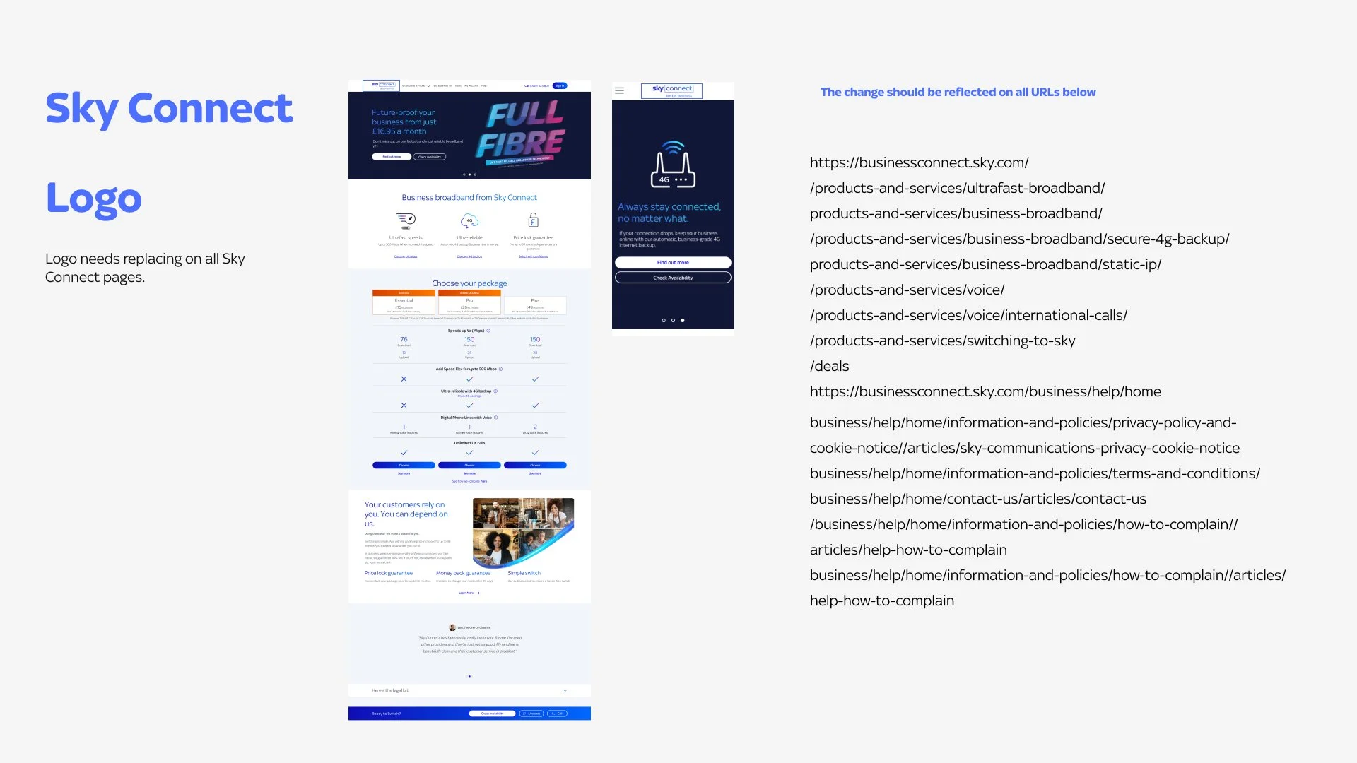
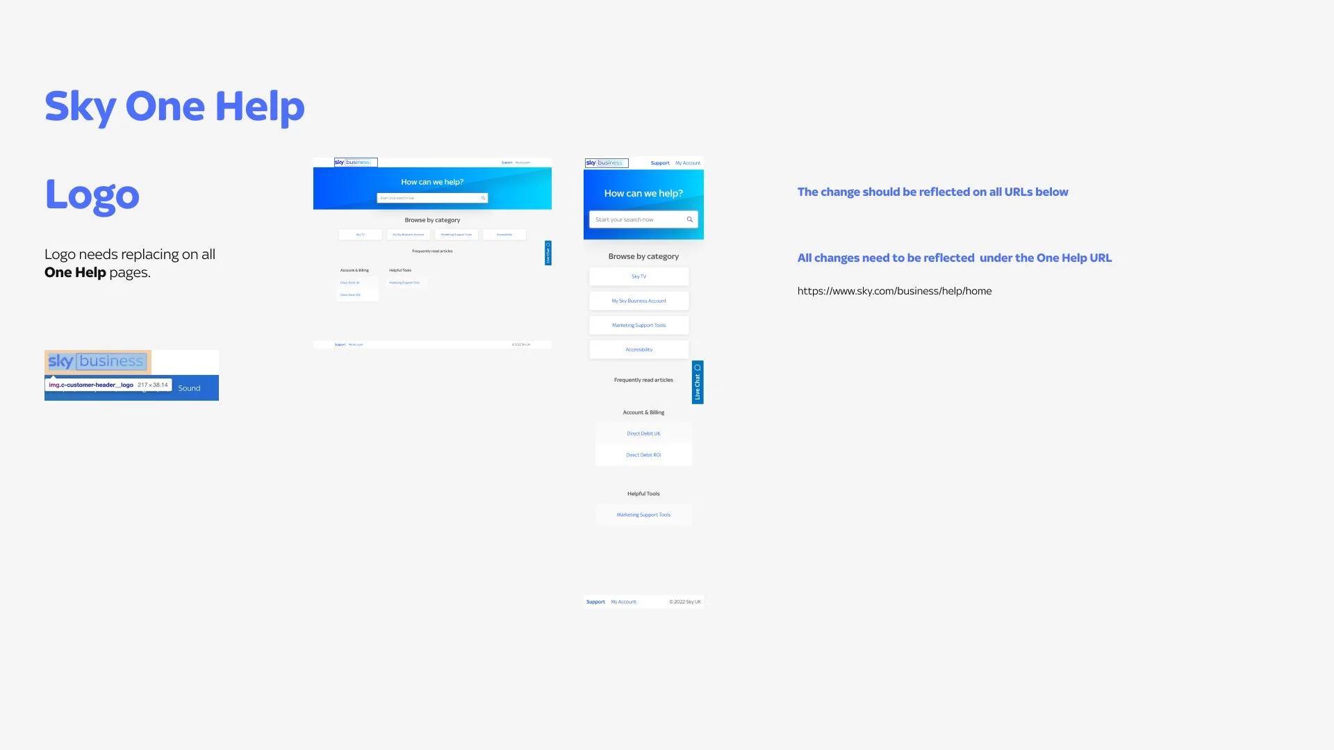
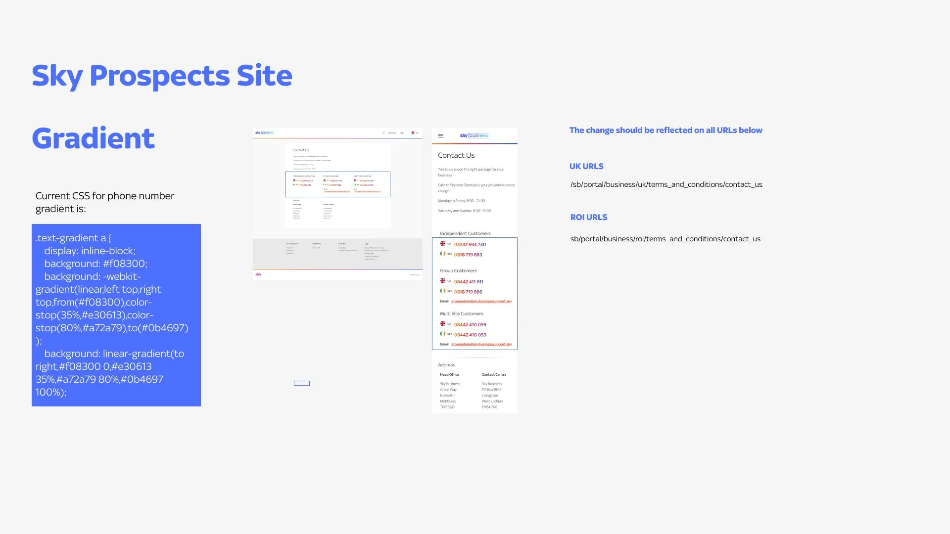
Design Audit
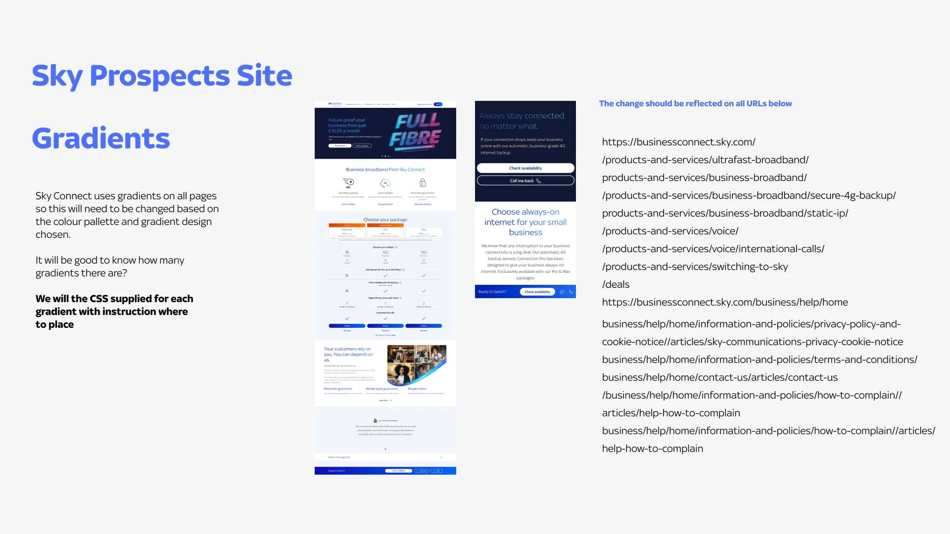
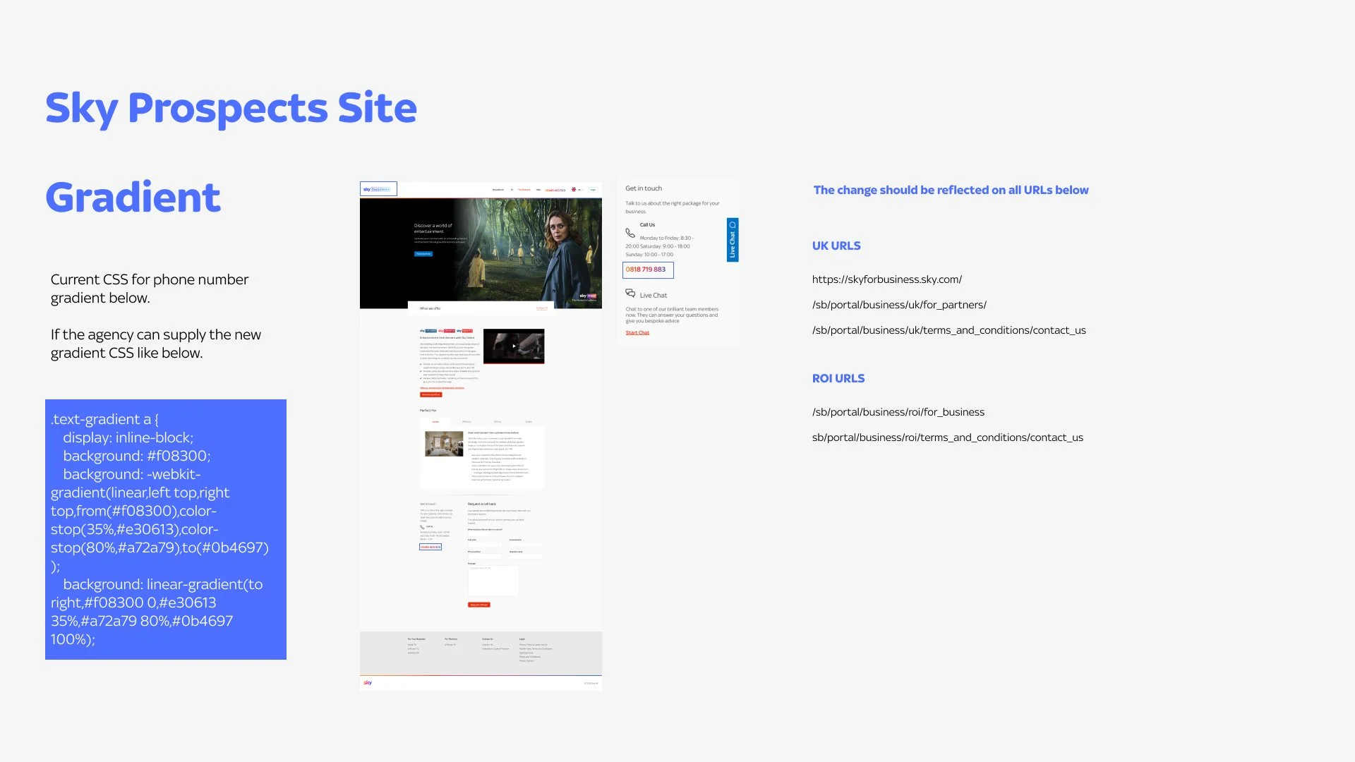
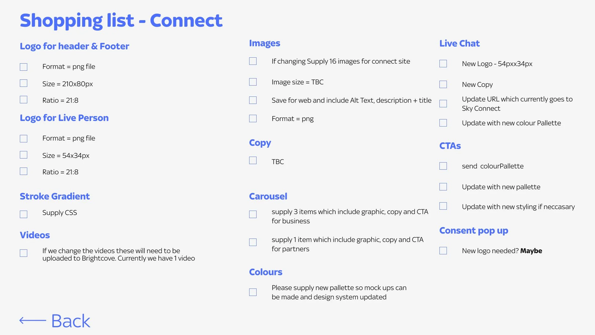
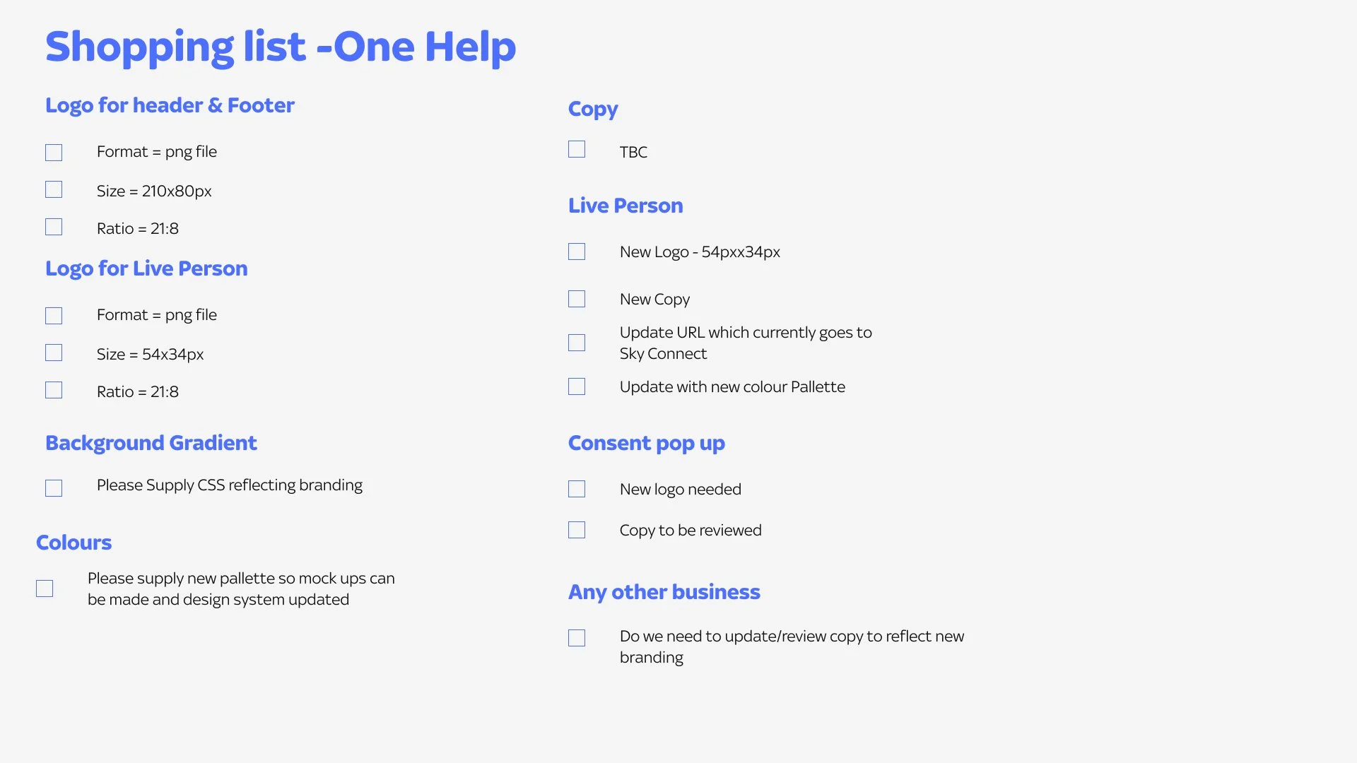
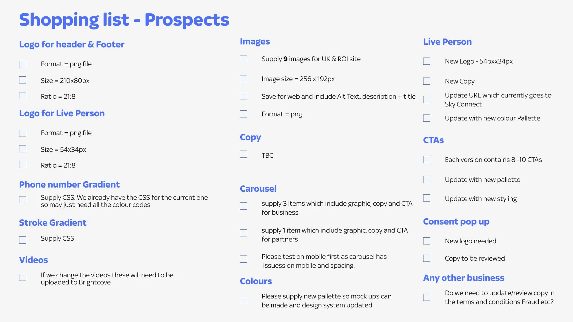
The design audit aimed to determine the quantity of assets required and identify areas for changes across various sites as part of the rebranding project. The audit was presented to senior stakeholders at Sky, highlighting the necessary logo updates in areas such as pop-ups, live chat, and more. It also addressed color, gradient, image, and button adjustments. To facilitate the briefing process, I compiled a preliminary shopping list (displayed below) that proved helpful.
Ensuring Accessibility and brand consistency
Sky is proud to be a member of The Valuable 500, a global business collective consisting of 500 CEOs and their companies working towards disability inclusion.
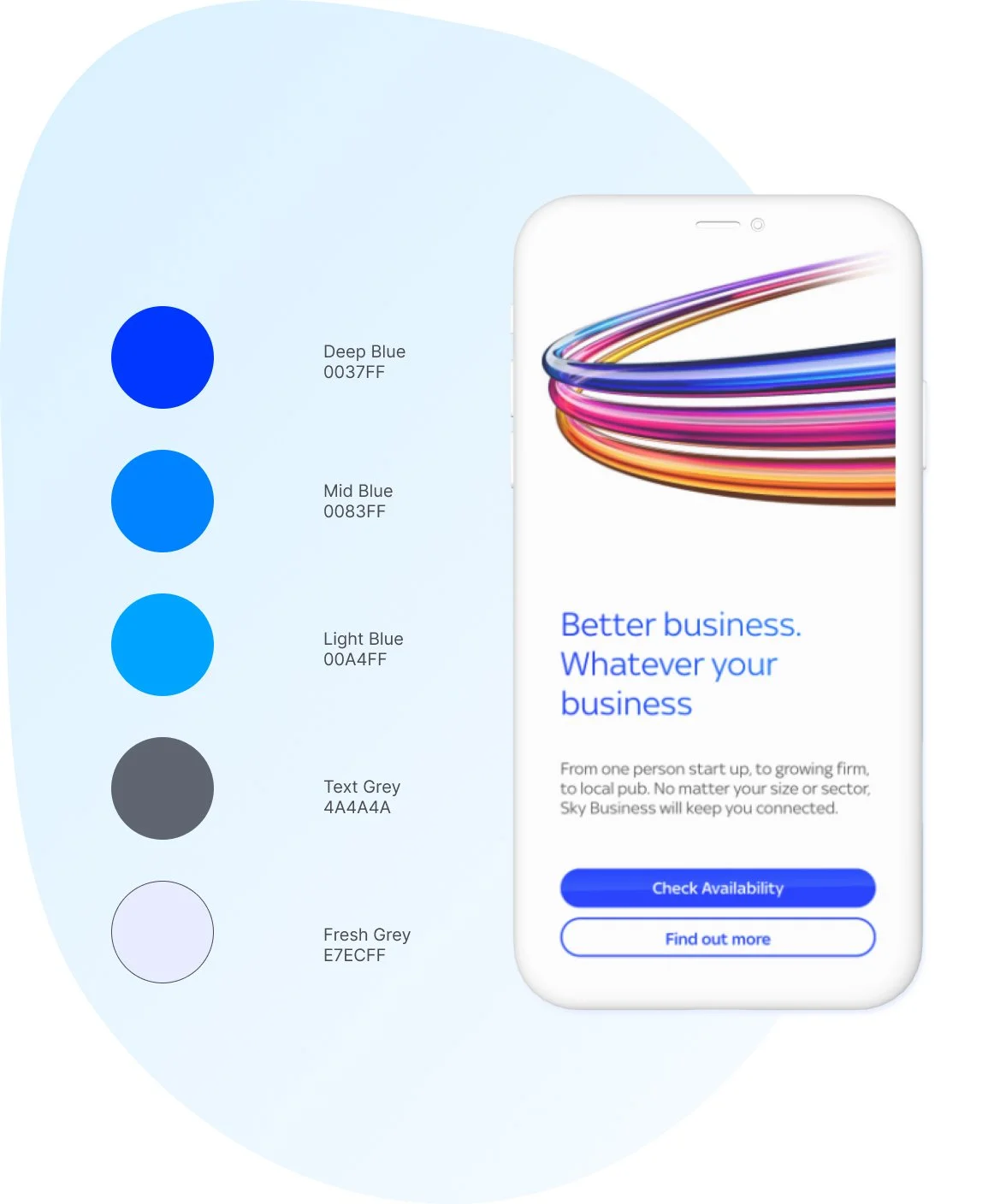
Sky Business worked with an external design agency who were tasked with supplying a new colour palette, logo and assets based on the audit I carried out.
On testing the new colour palette and logo I found that the palette was not accessible nor was the logo. The graphic displayed below shows the journey of the logo and how we iterated it to ensure it was accessible and consistent with sub Sky brands such as Sky Atlantic, Sky Cinema etc

Design
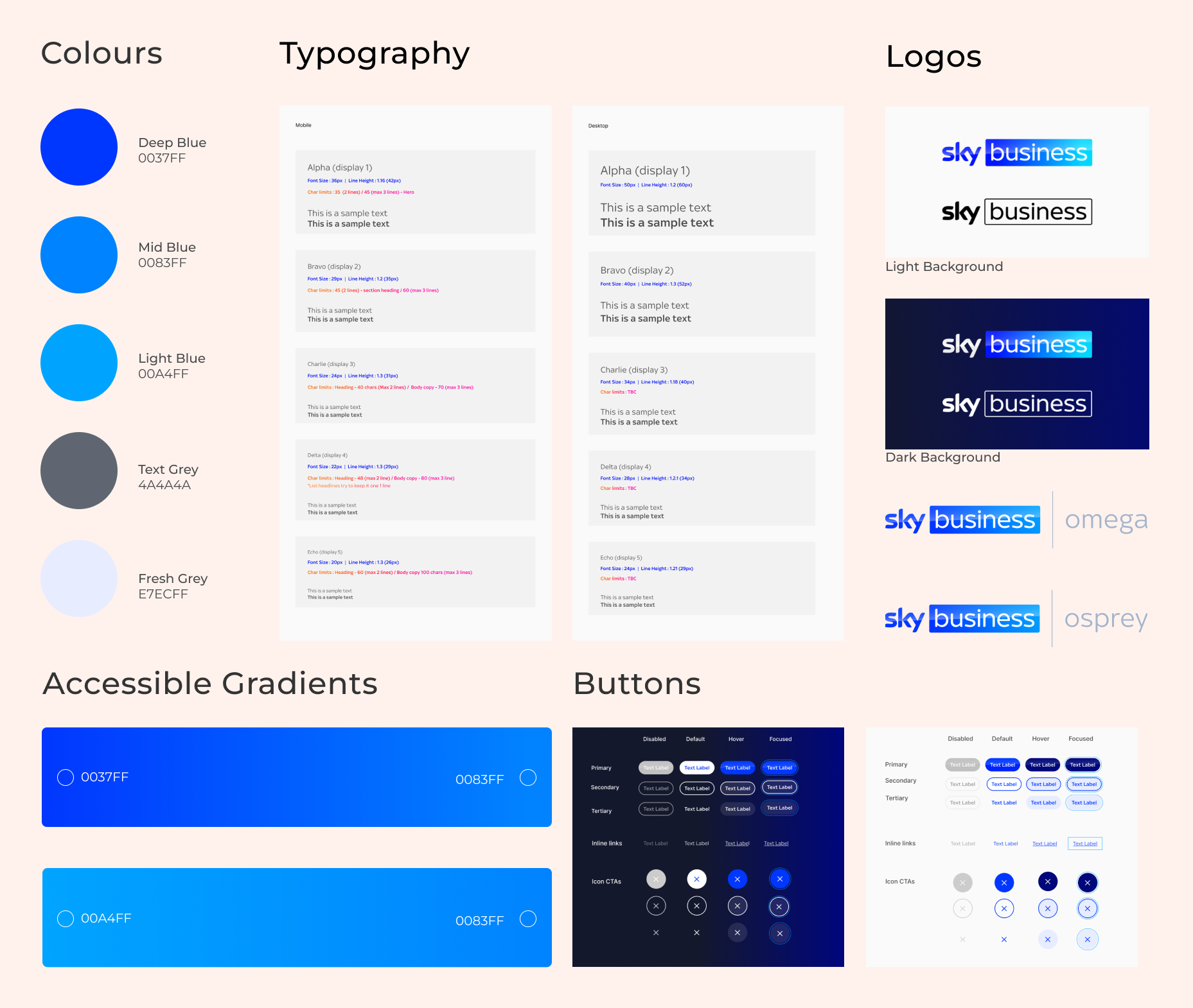
system foundations
After resolving the accessibility issues and receiving sign-off, I began updating the design system foundations in Figma and Storybook. This step was crucial, as updating the foundations enabled modifications of all other components with the new branding, allowing developers to implement changes across multiple Sky Business websites.
Results
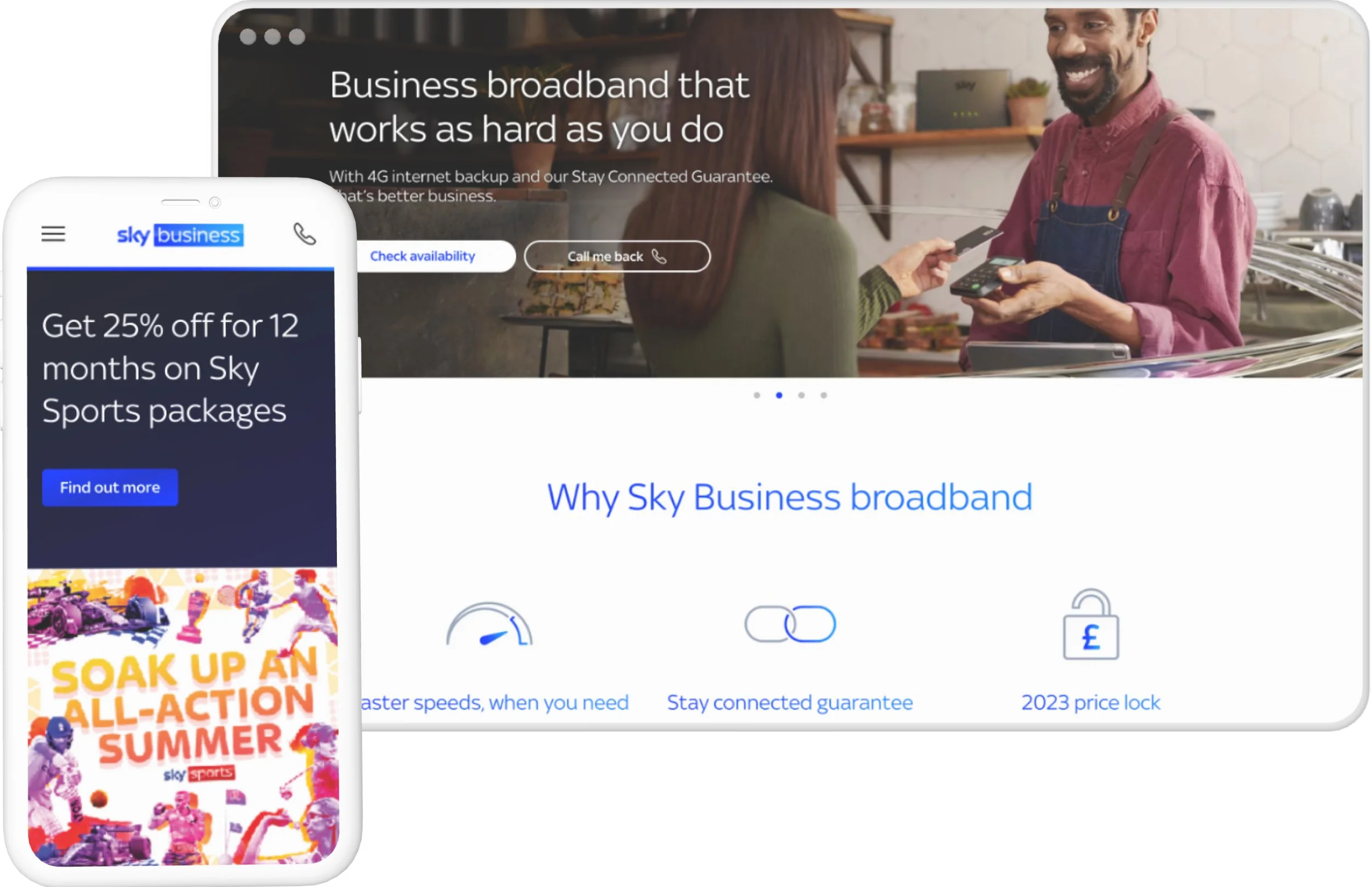
With consistent logo, typography, and color schemes, the landing pages ensured a visually cohesive user experience, reinforcing a unified brand identity.
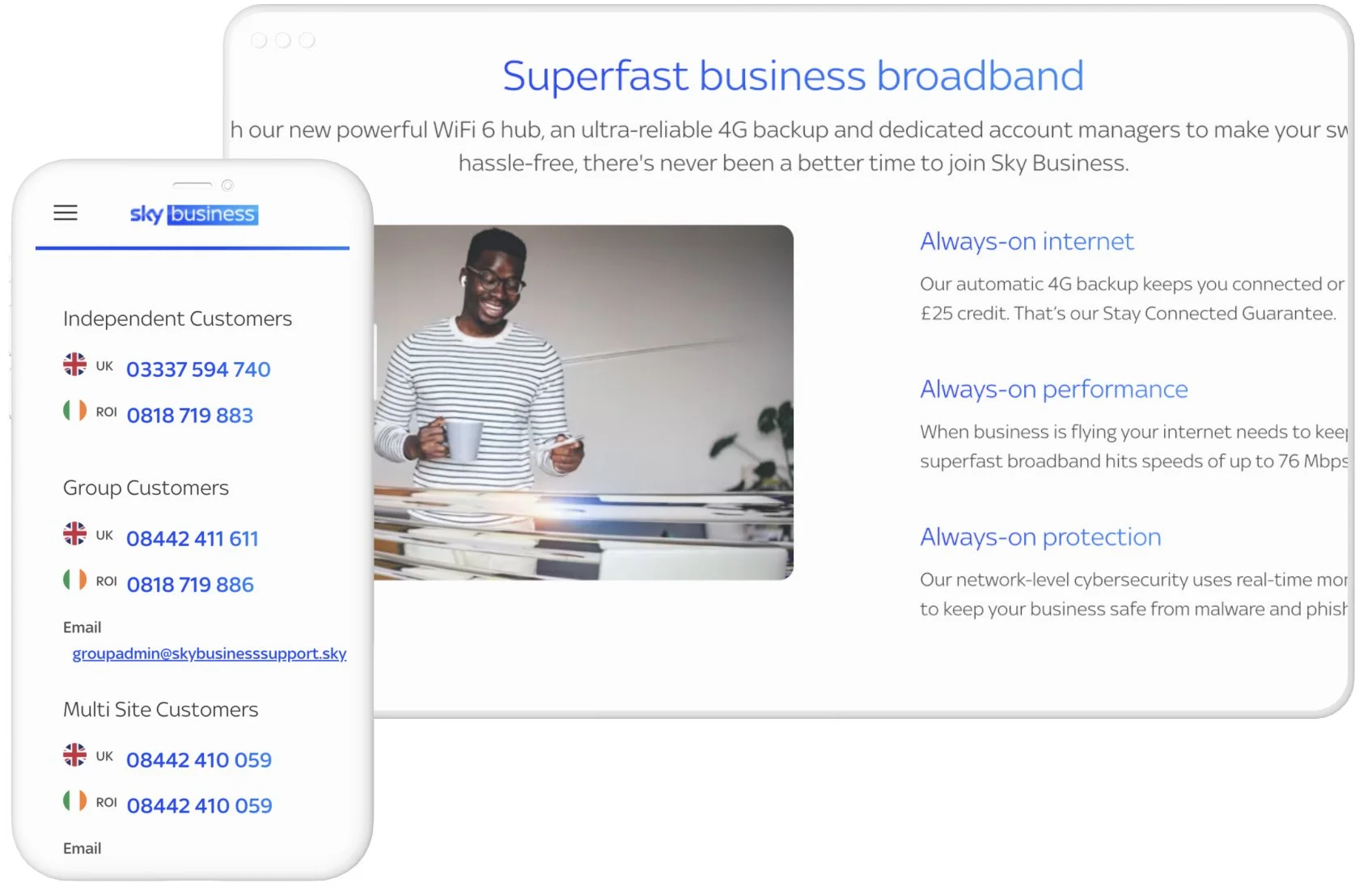
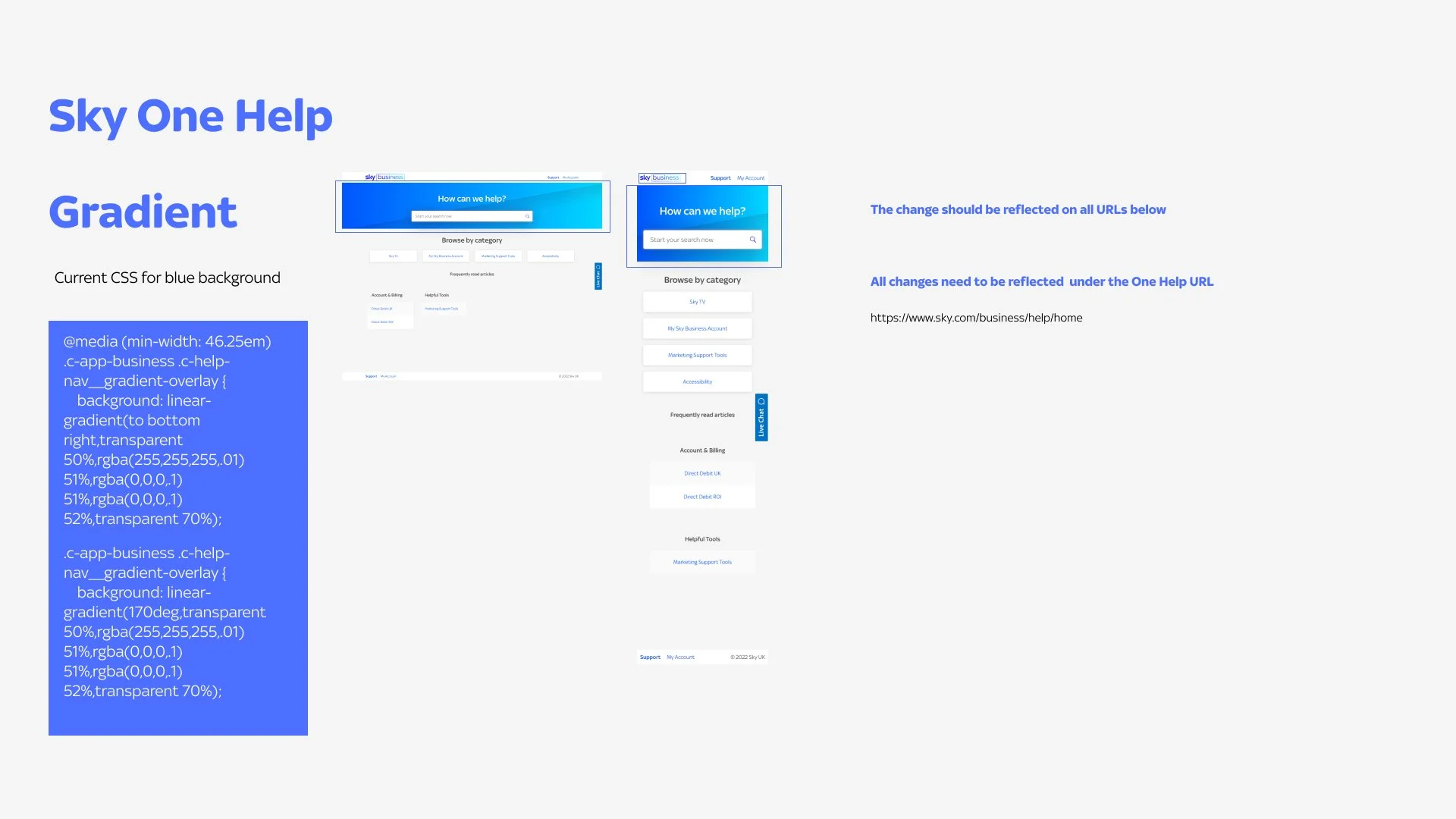
I was pleased to observe the consistent use of gradients across various websites, as they are a fundamental aspect of the branding. Furthermore, the work I conducted ensured that these gradients are accessible and comply with WCAG guidelines.

One Help, a self-service online help platform, allows users to find solutions to their issues without the need to call Sky, ultimately saving them time. I was delighted to witness the successful implementation of the new brand guidelines on One Help, which revitalised its appearance and user experience.
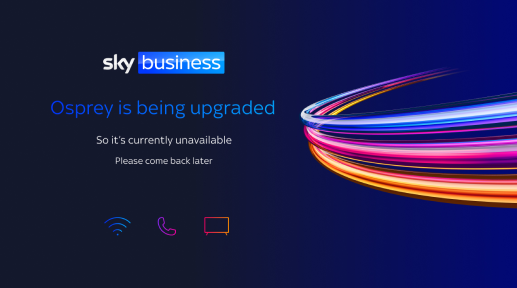
Sky Osprey and Omega
Osprey and Omega are internal CRM sites that are not directly customer-facing, yet they still needed to undergo rebranding. The following examples showcase the holding pages I designed to demonstrate the rebranding of these internal sites.

What was delivered

An new vibrant accessible colour palette which reflects Sky Business.

New logos that connects the Sky Digital estate as well as print.

A new button system that improved accessibility and the look and feel.

Better typography with clear tags improving SEO and accessibility.

UI enhancements for internal CRM sites that brings them into the fold.

A fresh vibrant feel to all websites helping relaunch Sky Business.

New assetts that could be used for social media and internal coms.

Updated and improved design system with foundations
and components.
Evaluation
The rebranding project for Sky Business was a triumph! The team collaborated well with the external design agency to create a comprehensive visual identity that effectively competes with other technology providers in the market, while ensuring consistency across multiple websites and user journeys to increase brand awareness. The new visual identity reflects Sky Business's commitment to digital accessibility, which aligns with the company's values and makes it stand out in the industry.
I enjoyed prioritising digital accessibility and inclusivity, making sure the new visual identity met user needs and set Sky Business apart from its competitors. To ensure a smooth transition, the team created a roadmap and allocated resources to the project.
If I could change anything about how I carried out this project I would have made it clear to the agency that accessibility needs to be prioritised and to ensure assets provided meet Web Content Accessibility Guidelines