
DIBZ
DIBZ, part of Sky Bet, puts a fresh spin on football betting, combining the excitement of the game with a swipe-based mechanic inspired by Tinder. This project was a great chance to push my motion and interaction design skills while getting hands-on with advanced prototyping in Protopie.
I also led workshops to fine-tune the user experience—working closely with stakeholders, gathering insights, and refining interactions to make the app feel slick and intuitive. From micro-interactions to high-fidelity prototypes, I helped shape a product that’s fast, fun, and effortless to use.
My Role
Product Designer
Year
2023/24
Background
DIBZ is a brand-new iOS and Android app that gamifies football betting. It brings a fresh, interactive twist to match-day wagers, making the experience more engaging and intuitive.
Concept
DIBZ blends football and bingo, creating a seamless way to bet on matches. Players can choose from pre-built bingo tickets for the biggest games and follow along as the action unfolds. The result? A fast, fun, and hassle-free betting experience. Download the app and get started.
Why was I contracted to work on DIBZ?
Sky Bet had already launched DIBZ by the time I joined, but user feedback made it clear there were some friction points—especially around how players sorted through bingo cards. The swipe mechanic needed refining to make the experience smoother and more intuitive. Based on user insights, below, I was brought in to improve the interaction and optimise the overall UX.

I just swiped one accidentally and it took me a long time to get back to it rather than just being able to swipe left! It's also not super clear that they rotate round rather than just 'go away' (well to me anyway) Orion

When I swipe left/right on a card, it’s unclear what this is actually doing, will I see that card again? Am I disregarding it and saying no I don’t want to bet on this? I feel with the intended audience, swiping left and right will be heavily related to left meaning no and right meaning yes. Ryan

it isn't clear if you are swiping a card away forever when you scroll through. Think it would be great to develop some functionality that makes it plain the cards will come back around once you start swiping. Joe

When dragging the ticket down to see the next ticket, the screen goes to the top, not sure if there is a better way to swipe the ticket and I’m just not doing it.' Christopher
Based on the initial feedback I collected I came up with a problem, how might we and mission statement.
Problem Statement
Based on user feedback, it was observed that customers faced challenges with our swiping mechanism. Commonly established user behavior dictates:
Left swipe = reject
Right swipe = accept
However, on DIBZ, users can swipe in all directions (left, right, up, and down), yet all interactions result in the ticket being moved to the back of the stack.
A secondary issue arises when users discover a ticket they like but wish to explore others or make comparisons. In such cases, they are required to swipe through the cards again.
How might we
How can we create a design that ensures users comprehend the outcome of their swipes in any direction?
Additionally, how can we enable users to identify and review cards they like without committing immediately, eliminating the need to swipe through the entire stack again?
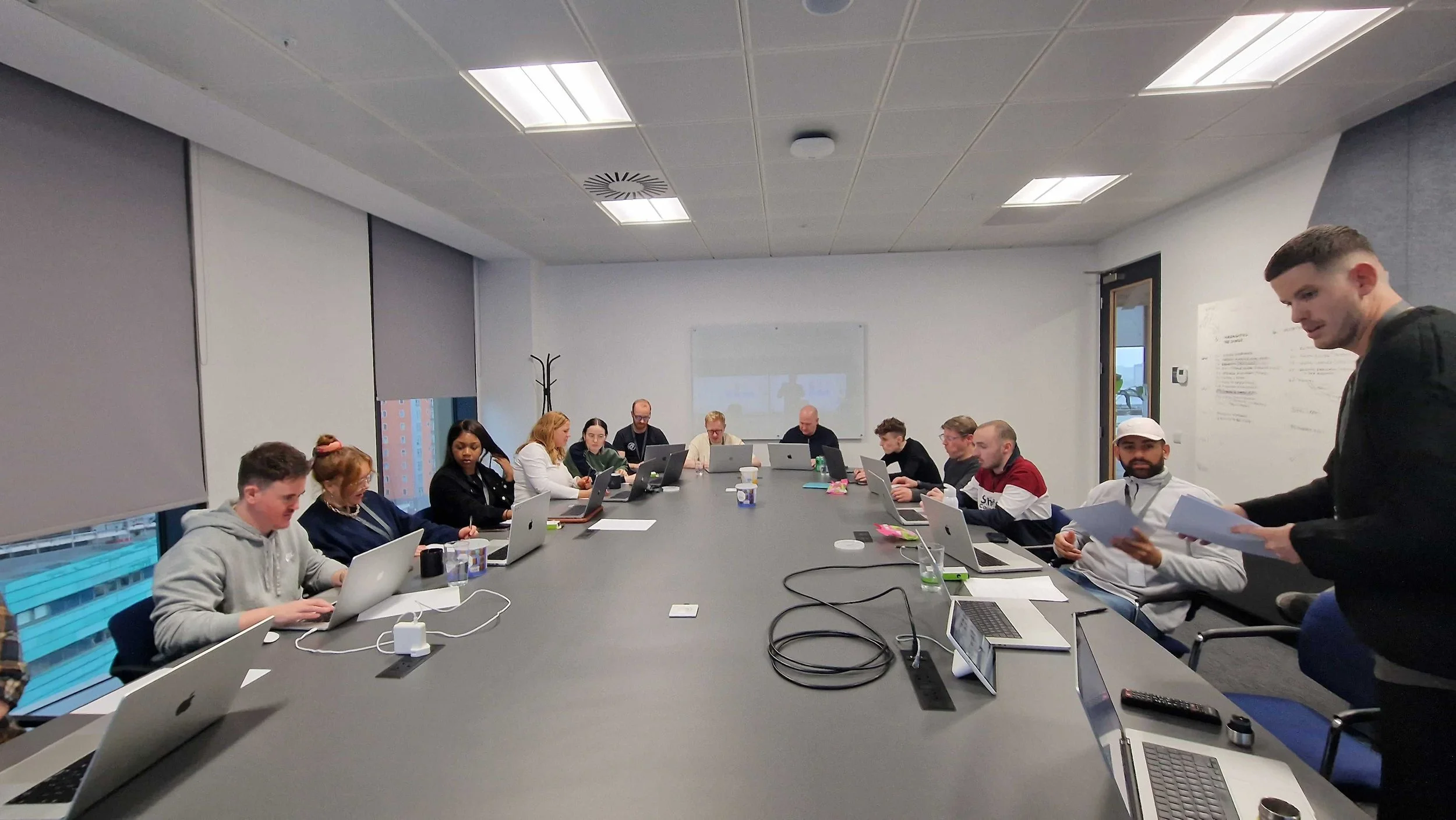
Kickoff Workshop
To kick off this project, I held a design workshop involving around 20 people from the Sky Bet Design Team. The aim of the workshop was to get everyone together and have fun while coming up with ways to solve the two problems identified in the user feedback.
Before the workshop, I asked all the participants to bring examples of apps where they thought the swiping mechanism was intuitive. I structured the workshop into several parts:
Introduction and Presentation of the Problem: Based on user feedback.
Group Discussion: Participants discussed the apps they had brought, highlighting what they liked and disliked.
Design Session: With a good grasp of the problem, participants drew their own designs and presented them to the workshop. Using FigJam, other participants could comment and give feedback on the concepts.
The workshop was really useful and enabled me to explore several ideas that this case study will examine.
Part 1. As part of the workshop this video will help explain the problem at hand.
Part 2: Workshop particpants were asked to bring apps along that we could review as part of the session. Here are some below.
Tinder:
Positive feedback on the progress bar, indicator, and easy access to settings. Users appreciate the ability to undo/go back and find nearby tabs handy.
o2
Positive feedback on simplicity and effectiveness. Concerns about hiding content in stacked lists.
Yonder:
Users liked the titles at the top of the sheet.
Users were a bit confused about the horizontal and vertical scrolling and found you could get lost.
iPhone Weather
Positive feedback on speed, responsiveness, and visual cues.
Users appreciate the bottom sheet for detailed information and the ability to stack and expand cards.
Positive feedback on visual clarity and easy navigation between tabs.
Some confusion about swiping directions and card interactions.
Spotify
Positive feedback on clean design, effectiveness, and clear swipe indications.
Suggestion to use the '+ functionality' for pinning cards.
Part 3: Workshop Participants' Time to Develop Concepts
After analyzing different apps and having a group discussion on likes, dislikes, and observations, we asked participants to illustrate how the swipe system and ticket confusion could be solved, using any media they preferred. Below are some of the outcomes along with their FigJam group reactions.
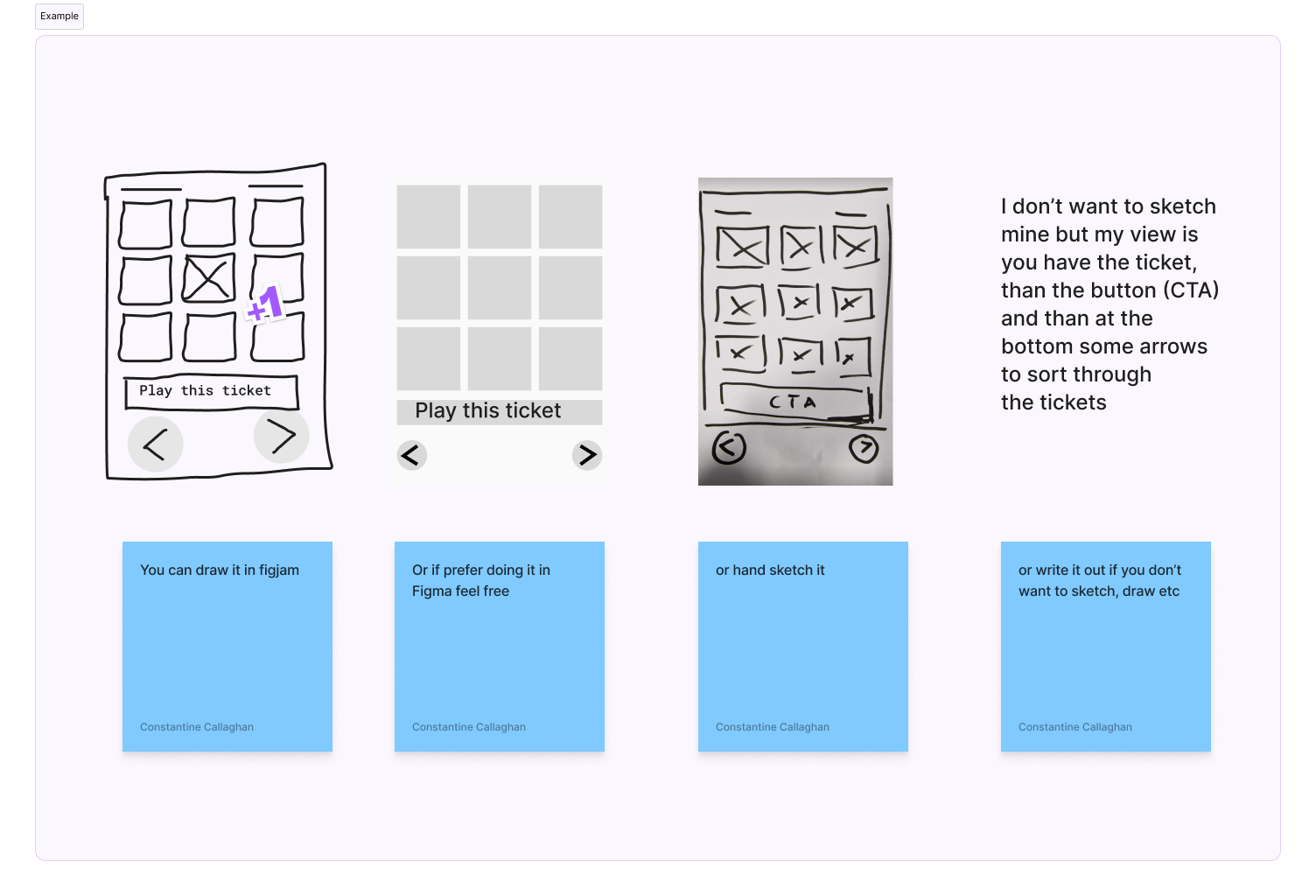


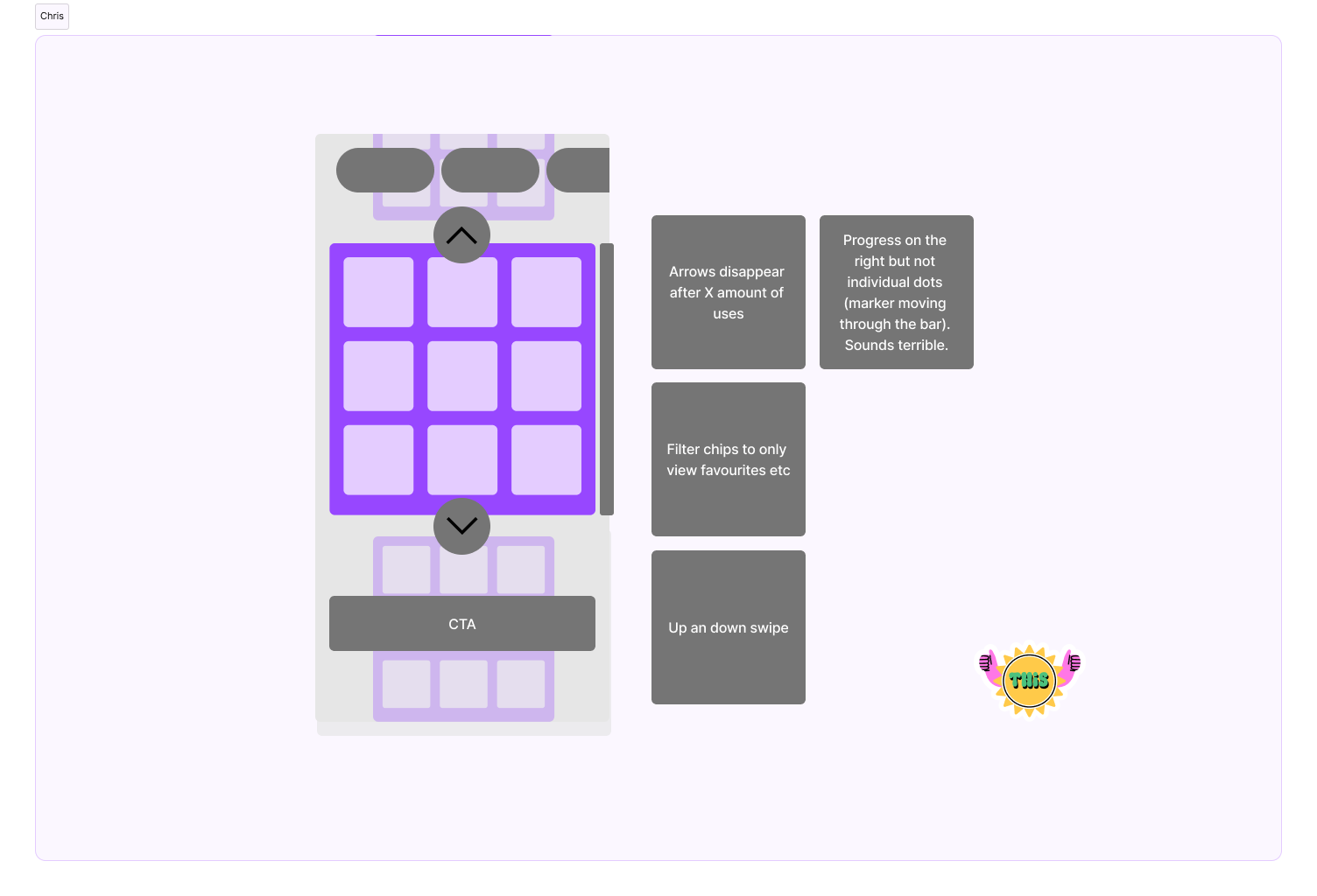
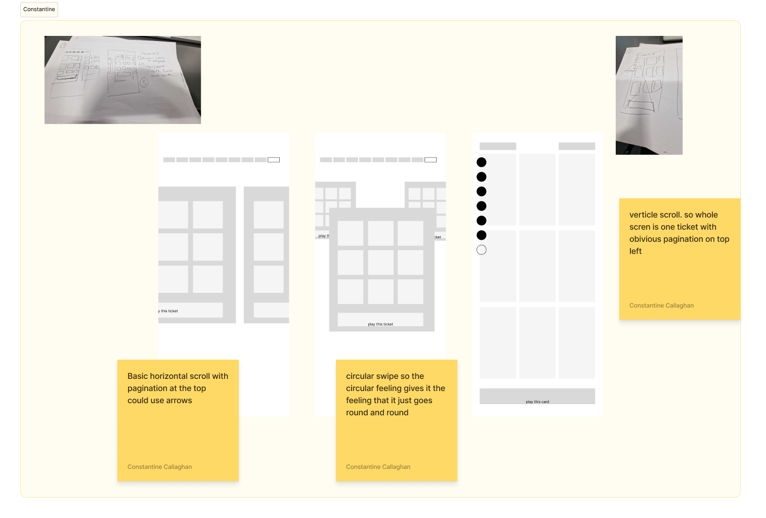
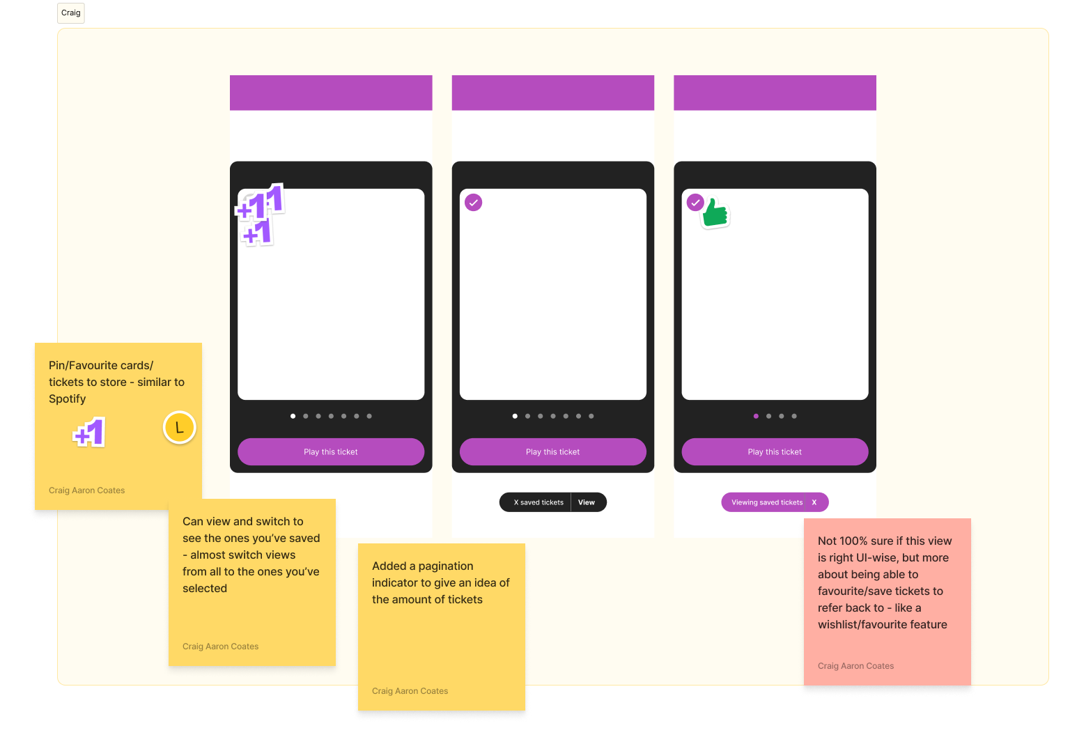
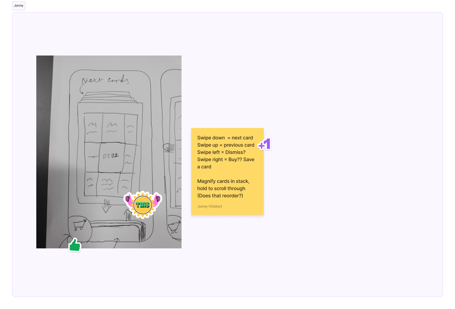


Outcomes of the workshop
The workshop was really successful and gave me direction of where to go.
Based on the feedback I decided that I would explore three areas.
Circular/stack Scroll which was an original idea that was never developed.
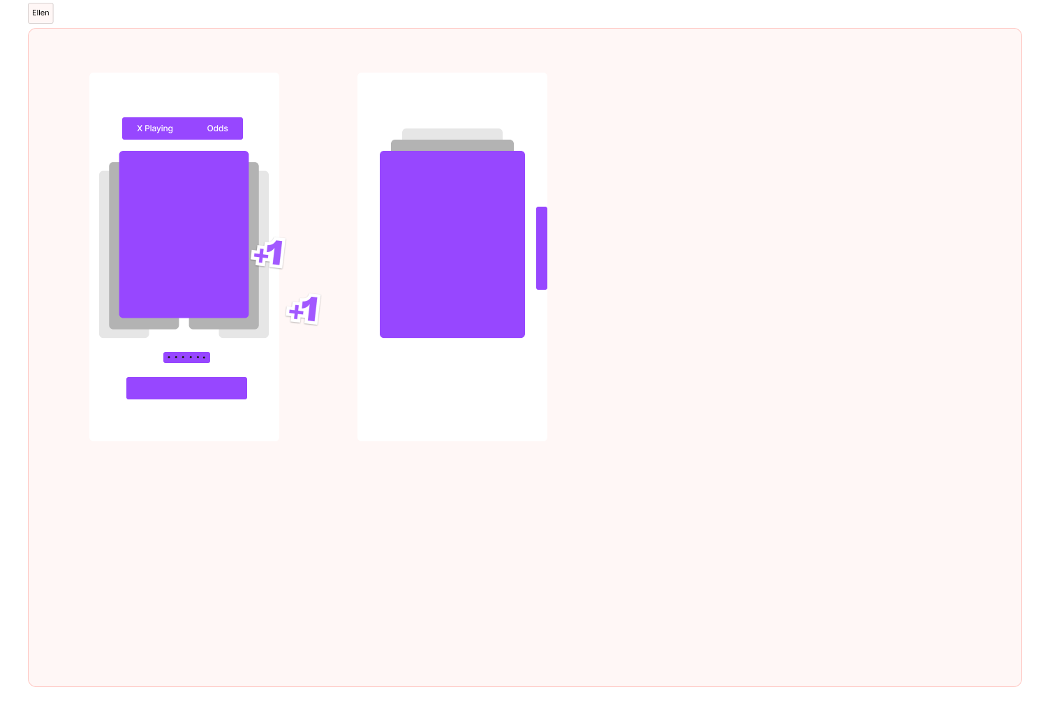
Horizontal scroll with the featured ticket larger including pagination
Verticle scroll with nav buttons and pagination
Motion design, Prototyping and learning Protopie
Horizontal Scroll
This concept proved to be really popular in the workshop, and it was an idea I wanted to develop further. I experimented with designing this in both ProtoPie and Figma and found that Figma's prototyping tools were sufficient for this purpose.
The pros of the horizontal swipe with pagination were that it was easy for users to see where they were, and it was possibly more accessible. However, the negatives were that in a tournament like the Euros, where there could be over 30 cards, it could become very tiresome.
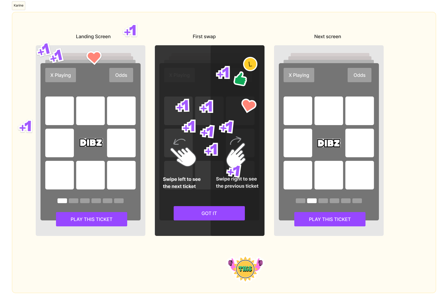
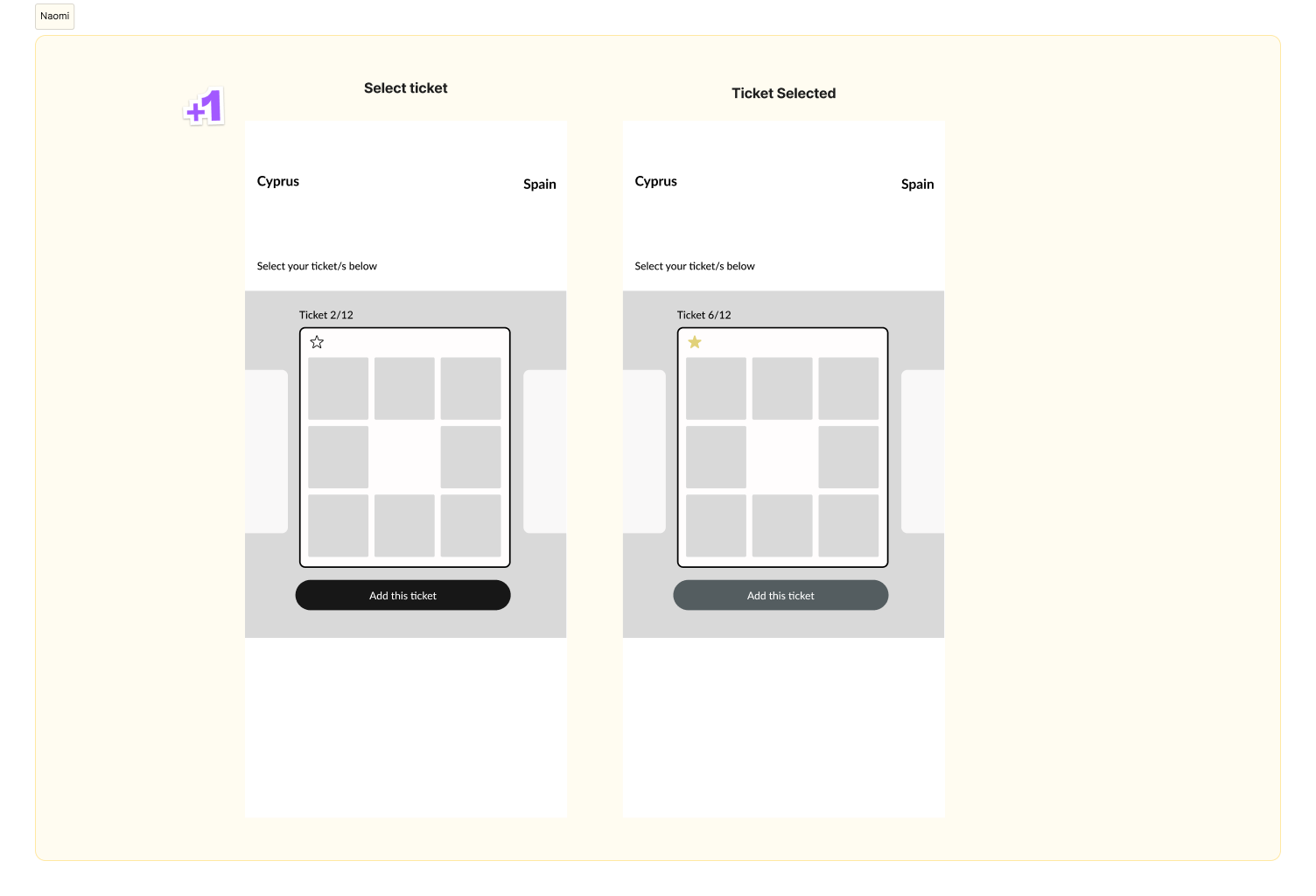
Left - right swipe
This concept was similar to what existed and would require the least development work. However, as highlighted in the workshop, we needed to inform users about the number of cards they had to swipe through.
A key point here is that the motion to move up and down was reduced, adopting a Tinder-style left or right movement, which aimed to lessen confusion.
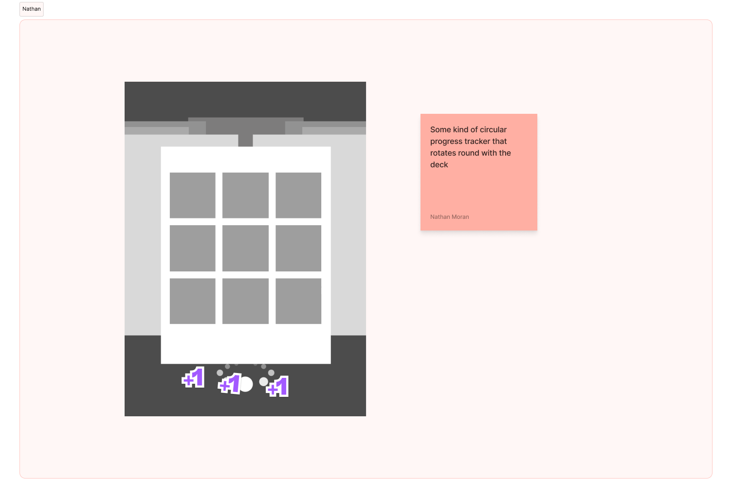
Circular Swipe
This concept proved to be the most challenging, as fitting all the cards at certain angles and matching the symmetry made it clunky and confusing to use. If I were to do this project again, I would address these challenges and find a solution to them. I think the concept is good, but it's a challenge to get it to work in an organized way.
Conclusion
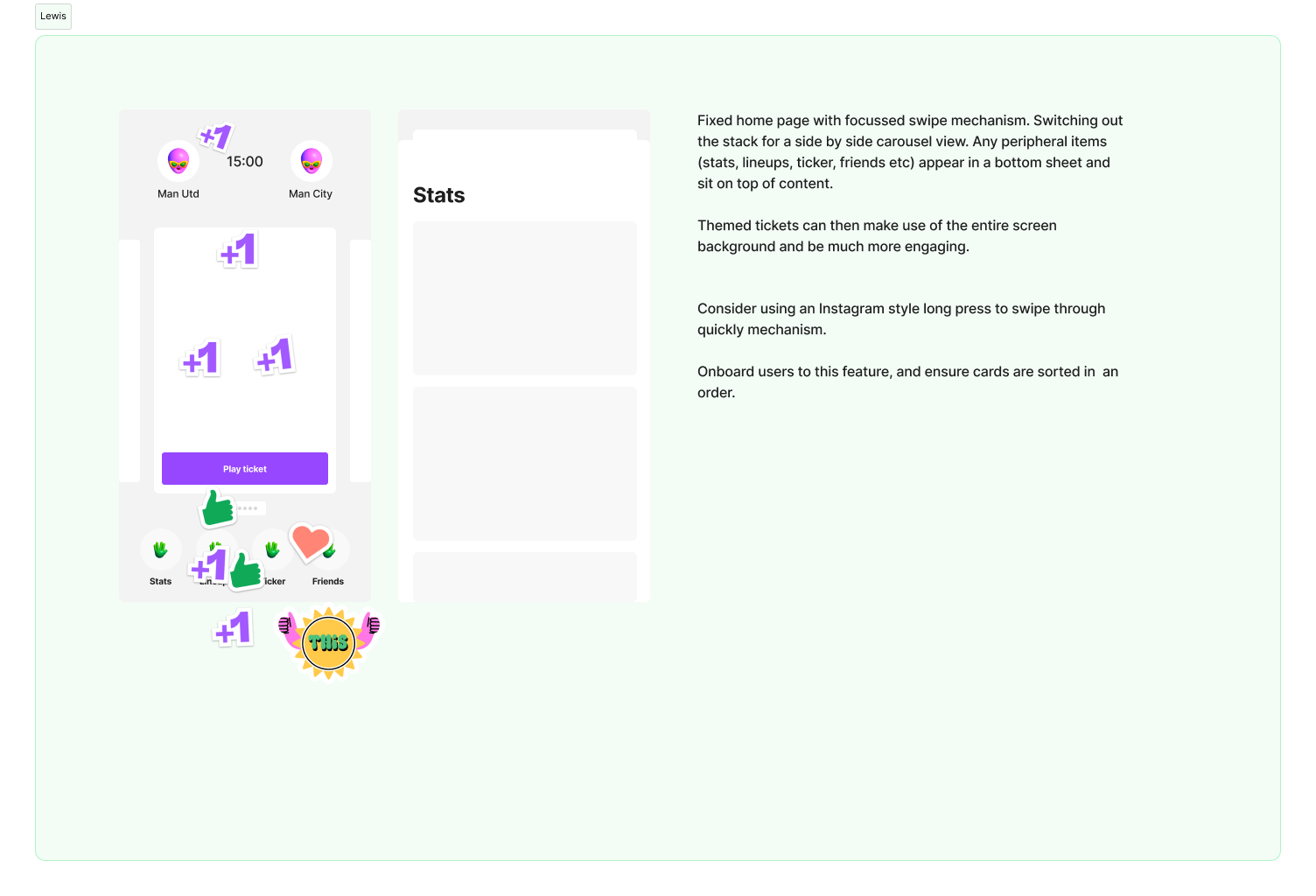
Overall, the project led to meaningful improvements in the DIBZ user experience, striking a balance between simplicity and engagement. The decision to refine the swipe mechanic while keeping future enhancements in the pipeline ensured a more intuitive journey for users without overcomplicating the first phase. With plans to introduce a ‘star’ feature in the next iteration, the app continues to evolve based on real user needs—proof that thoughtful UX design can directly shape product decisions.
Evaluation
I really enjoyed working on this project—it was a great opportunity to deepen my understanding of interaction design and push my skills in advanced prototyping with Protopie.
The workshops were especially valuable, providing key insights that shaped the final concepts. It was great to develop ideas based on real user feedback, and even better to see the whole Sky Bet team fully invested in making the experience as seamless as possible
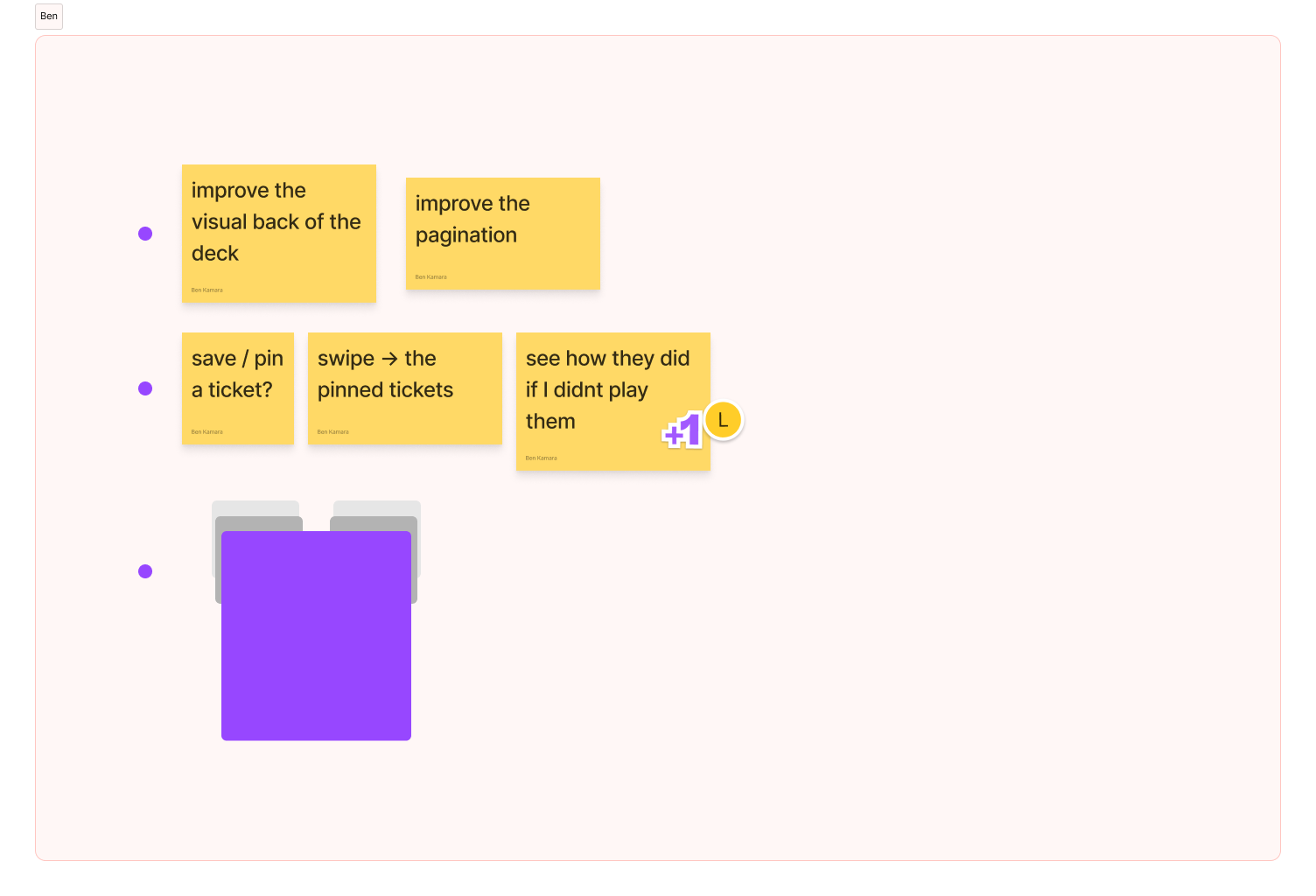
If I were to tackle this again, I’d explore a way to let users save tickets to a favourites list—allowing them to swipe through multiple options, filter out the definite nos, and keep the maybes and yeses for later.
Since DIBZ is still a new app, I expect they’ll gather even more insights over time, helping them fine-tune the swipe mechanic and continuously improve the experience based on real user behaviour.